Have you ever landed on a website, only to be greeted by a temporary screen before you could access the main content? That introductory page is often called a splash page. It serves various specific functions, though its use in modern web design is carefully considered due to potential impacts on user experience and search engine optimization.
Understanding what a splash page is, why they are used, and how they differ from other web page types is crucial for anyone involved in website planning, design, or digital marketing. This guide will provide a complete overview, drawing on established web design principles and user behavior insights.
What is a Splash Page?
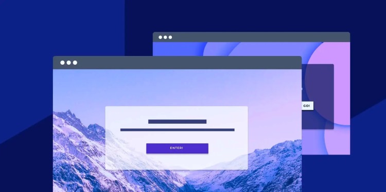
A splash page is a preliminary web page designed as an entry point that appears before a visitor reaches the primary content of a website. It acts as an interstitial step, meaning it is a page displayed in between the initial request and the desired destination page.
Its fundamental characteristic is that it typically requires some form of user interaction or a set duration before the visitor is automatically redirected or can manually proceed to the main website. This interaction is usually a click on a button like “Enter,” “Continue,” or making a selection.
This type of page is distinct because it usually contains minimal content and navigation compared to a homepage or other site pages. It’s designed to serve a singular, immediate purpose before handing the user off to the rest of the site experience.
Think of it like a brief lobby or an entrance screen for the digital space of a website. Visitors must pass through this gateway to access the inner workings and main information held within the site.
The design is often visually focused, perhaps showcasing a large image, a short message, or a specific call to action (CTA) related to its temporary purpose. A CTA is a prompt on a website that tells the user what action to take, such as “Click Here” or “Sign Up Now.”

What is the Purpose of a Splash Page?
Website owners implement splash pages with specific goals in mind. The overarching purpose is often to control or influence the user’s initial interaction with the site before they navigate freely.
They are used when there is a critical piece of information that must be presented to the user upfront, or a required action that needs to be taken before granting access to the core content. This isn’t a page you’d typically use just because it looks nice; there’s usually a functional driver.
These pages are not part of the main navigation structure in the traditional sense. Instead, they intercept the visitor’s path to the intended page, whether that’s the homepage or another internal page, to fulfill a prerequisite.
The intention behind using a splash page is to ensure a message is seen or a choice is made without distraction from the main website’s layout or content. This focused delivery is key to their function.
Common Uses and Examples
Splash pages are employed in various scenarios across different types of websites. The specific use dictates the content and interaction required on the page.
One very common example is an age verification splash page. Websites selling age-restricted products like alcoholic beverages, tobacco, or certain types of entertainment content legally require visitors to confirm they meet the minimum age. The splash page provides this gateway, asking for a date of birth or simply a yes/no confirmation before allowing access.
Another practical application is the language or region selection splash page. For global websites serving diverse audiences, presenting a choice of language or country upfront ensures visitors are directed to the version of the site most relevant to them, improving their overall experience. This is frequently seen on large e-commerce sites or international corporate websites.
Promotional or announcement splash pages are used in marketing contexts. These can feature a prominent banner about a limited-time sale, a new product launch, an upcoming event, or an invitation to sign up for a newsletter. The aim here is to ensure this specific marketing message gets maximum visibility immediately upon arrival. For instance, an online retailer might use a splash page for Black Friday sale announcements.
Some websites use splash pages for essential disclaimers or warnings. Sites providing medical information, legal advice, or potentially sensitive content might use a splash page to inform users about the nature of the information and require acknowledgment before proceeding, mitigating potential liability.
Less frequently now, you might see a simple stylistic splash page as a pure entry gate. This was more common in the past, sometimes with animations or intros, requiring a click to “Enter Site.” Modern web design generally advises against this use unless there’s a strong artistic or branding reason that genuinely enhances the experience without causing frustration.
In each of these examples, the core idea remains the same: an essential piece of information or a required interaction is placed before the main site content.
Marketing and User Experience Goals
From a marketing perspective, splash pages are sometimes used to force engagement with a key message, ensuring high visibility for promotions or important brand statements right at the outset of a visit. This can be seen as a way to control the initial narrative.
They can also serve the goal of segmenting users based on their initial choices, like language or region. This segmentation allows the website to deliver a more personalized and relevant experience on subsequent pages.
From a User Experience (UX) standpoint, the goal behind a necessary splash page (like age verification) is to fulfill a functional requirement cleanly. For language selection, the UX goal is to guide the user to the most usable version of the site immediately. UX refers to the overall experience a user has when interacting with a product, system, or service, encompassing their feelings, attitudes, and behaviors.
However, the use of splash pages for marketing or simple entry has sparked considerable debate within the UX community, primarily due to the potential for disrupting the user flow and adding friction to the Browse experience.
Splash Page vs. Landing Page vs. Homepage
Understanding the differences between these three types of web pages is fundamental in web design and digital marketing. While sometimes confused, they serve distinct roles in a user’s journey.
These are not interchangeable terms, and mistaking one for the other can lead to confusion in strategy and implementation.
Key Differences Explained
The splash page is the first page a user sees, acting as a gatekeeper before the site’s main content. It’s typically minimal, temporary, and often focuses on a single choice or message (like age or language) or a brief announcement. It usually lacks site navigation.
The homepage is the main hub and default destination for a website (unless intercepted by a splash page). It serves as the central navigation point, offering an overview of the site’s content and guiding visitors to different sections. It represents the core of the website’s structure.
A landing page, in the context of marketing, is a standalone web page specifically created for a marketing or advertising campaign. Users “land” on this page after clicking on a link in an email, ad, or search result. Its primary goal is conversion – getting the visitor to take a specific action (e.g., fill out a form, make a purchase), and it typically has no site navigation to minimize distractions from the Call to Action.
Comparing them directly: A splash page is a required step before the main site (including the homepage). A homepage is the central point of the main site. A landing page is a destination page for a specific campaign, often separate from the main site’s primary navigation structure, focused purely on conversion, and users don’t necessarily go through it to reach the homepage or other site content.
For example, a user might encounter an age verification splash page, click “Enter,” land on the homepage, and then click on a link to a marketing landing page about a specific product.
Advantages and Disadvantages of Using Splash Pages
Employing a splash page is a strategic decision with both potential upsides and significant potential downsides that need careful consideration.
There is no universal answer as to whether a splash page is “good” or “bad”; their effectiveness and appropriateness depend entirely on the specific use case, the target audience, and the implementation quality.
Potential Benefits
One key advantage is the ability to ensure crucial information is seen. For legally mandated disclaimers, age gates, or terms of service acceptance, a splash page guarantees the user acknowledges this information before proceeding, fulfilling compliance requirements.
They can also be highly effective for presenting essential choices, such as selecting a language or regional version of a site. This improves the user experience for multilingual audiences by immediately directing them to relevant content.
For strong brand moments or important, very temporary announcements (like site maintenance notices), a visually impactful splash page can ensure the message doesn’t get lost within the main site’s content structure, capturing immediate attention.
In some niche artistic or portfolio sites, a well-designed splash page can set a mood or showcase a key piece of work before the main site loads, acting as an artistic statement or an impactful visual introduction.
Potential Drawbacks
The most significant disadvantage is the friction they introduce into the user journey. An extra step or click delays access to the content the user originally sought, which can lead to frustration. Users generally prefer immediate access to information.
Splash pages can negatively impact bounce rate. If a splash page is slow to load, confusing, or perceived as an unnecessary barrier, users may simply leave the site before even reaching the main content. This means they “bounce” away quickly.
They can also negatively affect loading speed metrics, which are critical for both user experience and SEO. If the splash page itself is heavy with large images, videos, or complex scripts, it will slow down the initial loading time of the site.
From an accessibility standpoint, splash pages can pose significant challenges. Users relying on screen readers or keyboard navigation may struggle to interact with or bypass poorly coded splash pages, creating barriers to accessing the site’s content.
Furthermore, if not implemented correctly, splash pages can complicate how search engines crawl and index a site, potentially hiding main content from search engines, which is detrimental to SEO.
How Do Splash Pages Affect SEO and User Experience?
The presence of a splash page can have a notable impact on both how search engines perceive and rank a site, and how actual human visitors interact with it. These effects are closely intertwined.
While not inherently ‘SEO killers,’ improperly implemented splash pages frequently cause issues that negatively influence search visibility and user satisfaction.
Impact on SEO
Search engines like Google prioritize delivering the best possible results quickly. If a splash page significantly delays access to the main content or makes it difficult for crawlers to see the site’s primary information, it can negatively affect rankings.
Loading speed is a known ranking factor. A slow splash page increases the time it takes for the user to get to the actual content, which search engines measure. Faster sites generally rank better.
Google’s Mobile-First Indexing means they primarily use the mobile version of a site for ranking. A splash page must be perfectly responsive and easily navigable on small touchscreens; otherwise, it creates a poor mobile experience, hurting SEO.
Poorly implemented splash pages using techniques like redirects that confuse crawlers or hiding content behind scripts can prevent search engines from properly indexing the site’s content. Google wants to see the relevant content directly tied to the URL the user clicks on in search results.
While Google’s BERT algorithm understands the nuances of language and intent, a splash page with minimal text might lack the contextual signals that help search engines understand the topic and relevance of the page compared to the main content it gates. Semantic SEO relies on rich content and clear topical relevance.
From an E-E-A-T perspective, a site that provides a frustrating or slow entry experience via a splash page might be perceived as less trustworthy or authoritative compared to competitors offering immediate, easy access.
Impact on User Experience
As previously mentioned, the primary UX impact is the friction caused by adding an extra step. Users expect to land on the content they clicked for immediately. Any delay or required interaction can be annoying.
This friction directly contributes to a higher bounce rate. If a user arrives and is immediately presented with a barrier or delay, they are more likely to leave the site without exploring further.
Loading speed issues caused by the splash page also frustrate users. In an age of instant gratification, even a few extra seconds can lead to abandonment. Research consistently shows that users leave sites that load slowly.
Accessibility is a critical component of good UX. If a splash page is not built with accessibility in mind (e.g., not keyboard navigable, poor color contrast, not readable by screen readers), it alienates a significant portion of potential visitors.
The flow from the splash page to the main site must be seamless and intuitive. If the transition is confusing or the “enter” option is hard to find, it creates disorientation and a poor start to the user’s interaction with the brand.
When Should You Use a Splash Page?
Given the potential negative impacts on user experience and SEO, the decision to use a splash page should be made very carefully and is generally recommended only for specific, compelling reasons.
You should consider using a splash page primarily when there is a mandatory or critically important requirement that must be addressed before the user accesses the site’s main content.
This includes legal requirements such as age verification for restricted content or mandatory disclaimers that users must acknowledge. In these cases, the splash page serves a necessary functional purpose.
Using a splash page for language or region selection is also a valid use case, especially for large international sites, as it directly improves the user experience by tailoring the subsequent content to their needs from the outset.
Avoid using splash pages for purely aesthetic reasons, for non-critical announcements that could be displayed elsewhere (like banners on the homepage), or simply because you think it looks “cool.” These uses almost always prioritize form over function and negatively impact the user journey.
Essentially, use a splash page only when the benefit of fulfilling a necessary requirement or providing a crucial upfront choice outweighs the cost of adding friction and potentially impacting site performance and SEO. If the information can be conveyed effectively within the main site structure or via less intrusive methods like popups or banners, those options are usually preferable.
Best Practices for Designing an Effective Splash Page
If you determine that a splash page is truly necessary for your website, following best practices is essential to minimize negative impacts and optimize its effectiveness.
A well-designed splash page prioritizes speed, clarity, user control, and mobile responsiveness, even while serving its specific gating purpose.
Firstly, keep it brief. The time a user spends on the splash page, whether automated duration or waiting for a click, should be as short as possible. Aim for minimal load time and immediate interaction options.
Ensure it is fast-loading. Optimize any images or media used on the splash page to be as small as possible without sacrificing necessary quality. Avoid complex scripts or unnecessary third-party resources that delay rendering.
Make the purpose immediately clear. Users should instantly understand why they are seeing this page and what action they need to take to proceed. Confusing splash pages are a major source of frustration.
Provide a clear and obvious way to exit or proceed. The button or link to enter the main site should be prominent, easily clickable (especially on mobile), and clearly labeled. Avoid making users search for the entry point.
Ensure complete mobile-friendliness. With mobile-first indexing, your splash page must look and function perfectly on all device sizes. Touch targets should be large enough, and text should be readable without zooming.
Prioritize accessibility. Ensure the splash page is navigable using a keyboard alone and that screen readers can interpret the content and interactive elements correctly. Adhering to WCAG guidelines is crucial.
If it’s a timed splash page, provide an option for the user to skip the wait and proceed immediately. Giving users control improves their experience.
Finally, consider the SEO implications during implementation. Ensure the main site content is still discoverable by search engines and that the splash page doesn’t create redirect issues or hide essential textual content from crawlers.
Conclusion
A splash page is a specific type of preliminary web page that appears before the main content of a website, typically requiring user interaction to proceed. While they have valid uses, such as age verification, language selection, or presenting critical, temporary information, they also introduce friction and can potentially harm user experience and SEO if not implemented correctly.
Understanding the distinction between splash pages, homepages, and landing pages is key. When considering a splash page, website owners must carefully weigh the necessity of its purpose against the potential downsides of added steps, slower loading times, and possible negative impacts on bounce rates and search engine crawlability. Prioritizing clear communication, speed, mobile-friendliness, and accessibility through best practices is essential for any necessary splash page implementation.
A seamless user experience, starting even with a fast splash page, demands reliable hosting infrastructure. Achieve high speed and stable performance for your website with Vietnam VPS. Offering strong configuration using new generation dedicated hardware like AMD EPYC Gen 3rd processors and SSD NVMe U.2, they provide optimized capacity and high bandwidth with advanced virtualization technology at a cheap price.