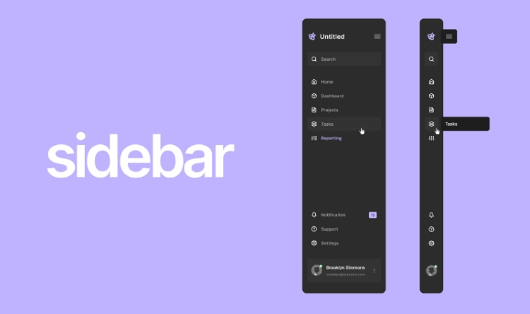
A sidebar is a vertical column area strategically placed alongside the main content area on a webpage. It serves as a distinct and separate section from the primary focus of the page, designed to hold navigation links, supplementary information, or interactive elements for visitors.
Think of a website sidebar like the margin in a book, but much wider and filled with useful items. It runs vertically, usually from near the top of the main content section down towards the bottom, clearly separated by spacing, lines, or background color.
Identifying a sidebar is quite straightforward. On desktop and laptop screens, you’ll typically see it as a dedicated column either to the left or the right of the central area where the main article text or primary page content resides. It’s a consistent visual element across many website designs.
This layout element is a fundamental part of many traditional and modern web design structures. Its presence helps to segment information on a page, guiding the user’s eye and organizing diverse content in a visually clear and accessible manner, contributing to the overall user interface.
Sidebars are integral components of multi-column website layouts. While single-column layouts focus purely on linear scrolling, layouts incorporating sidebars offer a way to present related or navigational information simultaneously alongside the core message of the page, adding layers of functionality.
They are not just decorative elements; sidebars serve specific roles in how users interact with and navigate a website. Their design and the content placed within them are carefully considered to enhance the user experience (UX) and achieve the website’s objectives, from providing quick links to driving conversions.
Unlike headers (at the top) or footers (at the bottom), sidebars utilize vertical screen space effectively. This vertical orientation makes them ideal for displaying lists of links, feeds, or stacked content blocks that complement the page’s main focus without embedding directly within the narrative.
Why Do Websites Use Sidebars?
The primary purpose of incorporating sidebars into website design is to enhance usability and provide efficient access to supplementary resources or actions. They function as persistent or contextually relevant information panels that support the user journey through the site.
One major use of sidebars is improving site navigation. While main navigation is often in the header, sidebars can host secondary or tertiary navigation menus, allowing users to explore sub-sections, related topics, or specific categories relevant to the page they are currently viewing.
Sidebars are excellent locations for calls to action (CTAs). Highlighting actions like “Sign Up,” “Download Ebook,” “Subscribe,” or “Shop Now” in a visually prominent sidebar can capture user attention alongside the main content, driving conversion goals effectively.
They are frequently used to display supplementary content that adds value but isn’t part of the core narrative. This can include links to related articles, lists of popular posts, category archives, tag clouds, or brief author biographies, enriching the user’s understanding and encouraging further exploration.
For websites relying on advertising or affiliate marketing, sidebars provide prime real estate for banners or promotional links. Their consistent visibility across pages makes them valuable spots for displaying advertisements that can generate revenue while maintaining separation from the main content flow.
Sidebars can also foster community engagement. Including social media follow buttons, recent comments feeds, or links to forums within a sidebar makes it easier for users to connect with the brand or community associated with the website content they are consuming.
In certain web applications or dashboards, sidebars might house tool panels or control options relevant to the main workspace. This allows users to access functions quickly without cluttering the main view, demonstrating their versatility beyond traditional blogs or static pages.
The strategic use of a sidebar can influence user scanning patterns. Research into eye-tracking shows users often scan in ‘F’ or ‘Z’ patterns; a well-placed sidebar can leverage these patterns to draw attention to key navigation or conversion elements after the initial scan of the main headline and content.
Historically, sidebars were almost standard on blogs and news sites, originating from layouts designed for desktop monitors. Their consistent presence helped users quickly orient themselves and access archives or related stories, establishing a convention many users still find intuitive.
Ultimately, the ‘why’ behind using a sidebar is about optimizing the use of screen space to serve both the user’s potential needs (navigation, related info) and the website owner’s goals (conversions, engagement, monetization), creating a multi-dimensional user experience.
What Kind of Content Goes in a Sidebar?
The content placed within a sidebar is typically concise and designed for quick scanning or interaction. It serves to complement the main content and guide the user’s actions or exploration of the site beyond the current page.
- Navigation Menus: Beyond the primary header navigation, sidebars often host secondary navigation relevant to a specific section or topic. Examples include sub-category lists, filtered views of content, or links guiding users deeper into a particular content silo.
- Related Posts/Popular Posts: Displaying links to articles similar to the current one or highlighting the most popular content on the site encourages users to stay longer and consume more information, reducing bounce rates and increasing page views.
- Category and Tag Archives: For blogs or news sites, sidebars often provide organized lists of content categories or tags. This allows users to easily browse articles grouped by topic, facilitating content discovery based on their specific interests.
- Search Bars: Placing a search bar in a prominent sidebar location provides users with a persistent tool to find exactly what they are looking for anywhere on the site, improving usability and satisfaction.
- Author Biography: On multi-author sites or personal blogs, a sidebar can feature a brief bio and photo of the author of the current article, building credibility and connection with the reader (contributing to E-E-A-T – Expertise, Authoritativeness, Trustworthiness).
- Social Media Icons and Feeds: Encouraging social sharing and building a social following is common. Sidebar placement for social media follow buttons or even embedded recent social feeds provides persistent visibility for social engagement points.
- Advertising Banners: Many websites monetize through advertising networks. Sidebars offer dedicated zones for banner ads that are visible without disrupting the flow of the main article content, a common practice across diverse online publications.
- Email Opt-in Forms: Building an email list is a key goal for many sites. Placing a prominent, yet non-intrusive, email sign-up form in the sidebar offers visitors a convenient way to subscribe to newsletters or updates while they are engaged with the content.
- Calls to Action (CTAs): Specific action buttons or banners like “Shop Our Products,” “Get a Free Quote,” “Contact Us,” or “Download Now” are frequently placed in sidebars to convert visitors into leads or customers by making the desired action highly visible.
- Testimonials or Social Proof: A rotating testimonial or a small section highlighting positive reviews or user statistics can be placed in a sidebar to build trust and credibility (relevant to E-E-A-T) with visitors as they consume content.
- Event Calendars or Upcoming Promotions: For websites promoting events, webinars, or sales, a sidebar can display a calendar or a brief list of upcoming dates and links, ensuring visitors are aware of timely opportunities.
These diverse examples illustrate that sidebar content is highly strategic. Each element is chosen based on the website’s goals, the type of content being presented, and the desired actions of the user, aiming to complement rather than compete with the main message.
Where Are Sidebars Located in a Layout?
The placement of a sidebar is a crucial design decision that impacts user experience and content hierarchy. Sidebars are almost always located vertically, positioned adjacent to the main content area on either the left or the right side of the screen layout.
- Left Sidebars: A sidebar placed on the left is common in languages that read from left to right (like English). Because the eye typically starts scanning from the left, a left sidebar can be highly effective for primary or important secondary navigation, as users encounter it early in their visual scan of the page.
- Right Sidebars: A sidebar on the right is arguably the most common placement across the web today. It often contains supplementary information, ads, or calls to action. Users typically scan the main content first and then look to the right for related items, making it effective for capturing attention after the primary information has been processed.
- Multi-Column Layouts: Sidebars are defining features of multi-column layouts. A two-column layout typically features one sidebar (left or right) and one main content area. A three-column layout includes a main content area flanked by two sidebars, offering even more space for supplementary elements, though this is less common on modern, minimalist designs.
The choice between left and right sidebar placement can influence how information is perceived and prioritized. A left sidebar might suggest the elements within it are more foundational or navigational, while a right sidebar might imply the content is supplementary, actionable, or promotional.
Designers consider user flow and eye-tracking studies when deciding placement. The goal is to guide the user’s attention logically through the page, ensuring that both the main content and the sidebar elements serve their intended purpose without overwhelming the user or creating visual confusion.
Consistency in sidebar placement across a website is generally a best practice. Users develop expectations about where to find certain types of information (like navigation or related links), and consistent placement reinforces these learned behaviors, improving site navigability.
While left and right are standard, some less common layouts might blur the lines, sometimes featuring side-like sections that function similarly but might not be strictly defined as traditional sidebars, especially in highly customized or experimental web designs.
How Sidebars Are Managed (CMS & Widgets)
For most website owners, particularly those using Content Management Systems (CMS), managing sidebar content does not require coding knowledge. CMS platforms provide intuitive interfaces to control what appears in these areas, simplifying the process significantly.
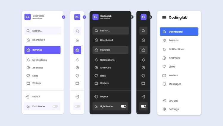
A core concept in CMS sidebar management is the ‘Widget’ (or sometimes ‘Block’ or ‘Module’). Widgets are small, pre-packaged units of content or functionality that perform a specific task, like displaying a list of categories, showing a search bar, or embedding a custom HTML block.
CMS platforms like WordPress, Joomla, and Drupal define specific ‘sidebar areas’ (often called ‘widget areas’) within the website’s theme. These are designated zones in the layout where widgets can be placed, typically including one or more sidebar areas, footer areas, and sometimes header areas.
Managing a sidebar involves accessing the website’s administrative dashboard. Within the appearance or layout settings, users find a list of available widgets and the predefined sidebar areas. They can then simply drag and drop desired widgets into the chosen sidebar area.
The order in which widgets appear in the admin area list corresponds to their vertical order in the actual sidebar on the live website. Users can easily rearrange widgets by dragging them up or down within the sidebar area in the dashboard, controlling the hierarchy of content.
Themes play a crucial role in sidebar management. A theme determines where sidebar areas exist in the layout (e.g., “Right Sidebar,” “Left Sidebar Below Header”) and often dictates the default styling and available widget options, providing the structural framework for sidebars.
Advanced users or developers can create custom widgets or modify theme files to alter sidebar behavior or appearance beyond the standard drag-and-drop functionality. However, for basic content management, the widget system in a CMS is designed for accessibility and ease of use.
This system democratizes website management, allowing individuals without technical backgrounds to customize the look and feel of their sidebars. It transforms the sidebar from a static design element into a dynamic, easily updatable content zone controlled through a simple interface.
Sidebars and Responsive Web Design
The widespread adoption of mobile devices has significantly impacted how sidebars are treated in modern web design, particularly through the principles of responsive design. Responsive design (Doc 14) ensures websites adapt their layout to fit various screen sizes, from large monitors to small smartphones.
On smaller screens like phones, the limited horizontal space makes displaying a vertical sidebar alongside the main content impractical. Doing so would either shrink the main content too much, making it unreadable, or force excessive horizontal scrolling, creating a poor user experience.
Therefore, in a responsive layout, sidebars are typically rearranged for mobile views. The most common approach is to move the sidebar content below the main content area. Users scroll through the primary article or page, and then encounter the sidebar content towards the bottom.
Another common responsive strategy is to hide the sidebar content by default and provide a toggle button (often a “hamburger” icon) that reveals the sidebar content, usually as an overlay or by pushing the main content aside. This keeps the initial mobile view clean while making sidebar content accessible.
The decision to move or hide sidebar content on mobile necessitates careful consideration of its importance. If crucial navigation links or calls to action are only in the sidebar, they must be replicated or easily accessible elsewhere in the mobile layout (like the header or footer) to maintain usability and SEO value (Doc 14 implications for mobile-first indexing).
From an SEO perspective influenced by mobile-first indexing (Doc 14), Google primarily evaluates the mobile version of a page. While content moved below the fold is still indexed, ensure truly critical links or content are also accessible or linked within the main mobile view if they were previously only in the desktop sidebar.
Designers and content strategists must plan for this transformation. The content chosen for sidebars should ideally be supplementary or easily discoverable elsewhere on mobile, or the mobile layout must provide an intuitive way to access the relocated sidebar information.
Understanding responsive sidebar behavior is key for both designers and users. It explains why the website layout changes on your phone and highlights the design challenges involved in making content accessible and usable across a spectrum of devices while prioritizing the core message.
Sidebar vs. Other Webpage Components
Understanding what a sidebar is can be further clarified by comparing it to other standard webpage components: the header and the footer. While all are parts of the overall page structure, they serve different primary functions and occupy distinct areas of the layout.
- Header: The header is located at the very top of a webpage. Its primary role is site-wide identification and navigation. It typically contains the website logo, the main navigation menu that links to core pages (Home, About, Contact, Services, etc.), and sometimes a search icon or utility links. Headers are generally consistent across an entire website.
- Footer: The footer is found at the very bottom of the webpage. It usually contains information that is less critical for immediate navigation but important for completeness and legal compliance. Common footer content includes copyright notices, privacy policy links, terms of service, contact information, social media links, and sometimes a sitemap or abbreviated navigation. Footers are also typically consistent across the site.
- Sidebar: As discussed, the sidebar is a vertical column alongside the main content. While it can contain navigation, this navigation is often secondary or context-specific rather than the primary site-wide menu. Its content is more dynamic and can vary significantly from one page type (e.g., blog post) to another (e.g., product page), unlike the generally static header and footer.
The key distinction lies in placement, orientation, and typical content purpose. Header (top, horizontal, primary navigation/branding), Footer (bottom, horizontal, legal/utility links), and Sidebar (side, vertical, supplementary navigation/content/CTAs).
These three elements work together within the website layout to frame the main content area, providing necessary context, navigation, and supplementary information to the user in a structured and organized manner. Each plays a vital role in guiding the user and enhancing the overall site experience.
In Summary: The Role of Sidebars in Web Usability
In conclusion, a sidebar is a crucial vertical section of a webpage layout, separate from the main content. Its core definition is simple: a dedicated column on the left or right used for supplementary information and navigation elements that support the primary content and user goals.
Sidebars are employed to enhance website usability by providing quick access to related information, calls to action, or secondary navigation, effectively utilizing screen space to present multiple layers of content concurrently and guiding the user’s journey through the site.
From displaying related articles and social links to hosting navigation menus and opt-in forms, the content placed in a sidebar is strategic, chosen to complement the main topic, encourage exploration, or drive conversions, making it a dynamic and valuable area of any webpage.
Understanding what a sidebar is and its function is fundamental to grasping basic web design principles and how webpage layouts are structured to deliver information efficiently and effectively to visitors across different devices, contributing significantly to a positive user experience.
Creating a website with elements like sidebars needs reliable hosting. Vietnam VPS offers quality, reputable, stable service using new generation dedicated hardware: AMD EPYC Gen 3th processors, SSD NVMe U.2 storage, advanced virtualization technology. Get high speed, strong configuration, optimized capacity, high bandwidth, and cheap prices for your high-end site.