Ever clicked an online ad or an email link and arrived at a web page focused solely on what was promised? That was likely a landing page. Understanding what a landing page is unlocks a powerful concept in digital marketing and online advertising, crucial for anyone aiming to achieve specific goals online.
A landing page is essentially a standalone web page created specifically for a marketing campaign or advertisement. Its primary purpose is to concentrate visitor attention on a single objective, guiding them towards a specific action known as a conversion. It’s different from your main website homepage which serves broader goals.
This targeted approach is fundamental to its effectiveness. Think of it as a focused conversation versus walking into a busy department store. This clarity helps businesses improve results from their marketing campaigns, whether using PPC (Pay-Per-Click) ads, email marketing, or social media promotions. Let’s dive deeper into understanding these vital marketing tools.
This article will clearly define what landing pages are, explore their core purpose and benefits, highlight the key differences between a landing page vs. homepage, break down the essential components that make them work, discuss common types, and showcase real-world examples. You’ll gain a solid grasp of this foundational marketing concept.
The Core Purpose: Why Use a Landing Page?
The fundamental reason businesses use landing pages is focus. By dedicating a page to a single conversion goal, you create a clear path for visitors. This eliminates distractions and directly supports the objective of a specific marketing campaign, leading to significantly better results compared to general pages.
One major benefit is improved conversion rates. When a visitor lands on a page that perfectly matches the message of the ad or link they clicked (this is called message match), and presents a single, clear action, they are far more likely to convert. There’s less confusion about what to do next.
Landing pages are also vital for tracking marketing campaign effectiveness. Because each page is tied to a specific campaign or traffic source, you can precisely measure how well that initiative performs. You can see which ads, emails, or posts are driving actual conversions, allowing for better optimization.
Furthermore, a dedicated landing page allows for targeted messaging. You can tailor the content, headline, and offer specifically to the audience segment you’re reaching through that particular campaign. This level of personalization resonates more strongly with visitors, making them more receptive to your value proposition.
Imagine you’re promoting a new e-book. Sending ad traffic to your homepage forces users to search for the e-book. Sending them to a dedicated landing page presents the e-book immediately, explains its value, and provides a simple way to download it – a much smoother and effective user journey.
Ultimately, the purpose of a landing page is to maximize conversions for a specific marketing goal. They provide clarity, focus user attention, enable precise tracking, and facilitate targeted messaging, making them an indispensable tool in modern digital marketing strategy for effective lead generation and sales.
Landing Page vs. Homepage: Understanding the Key Differences
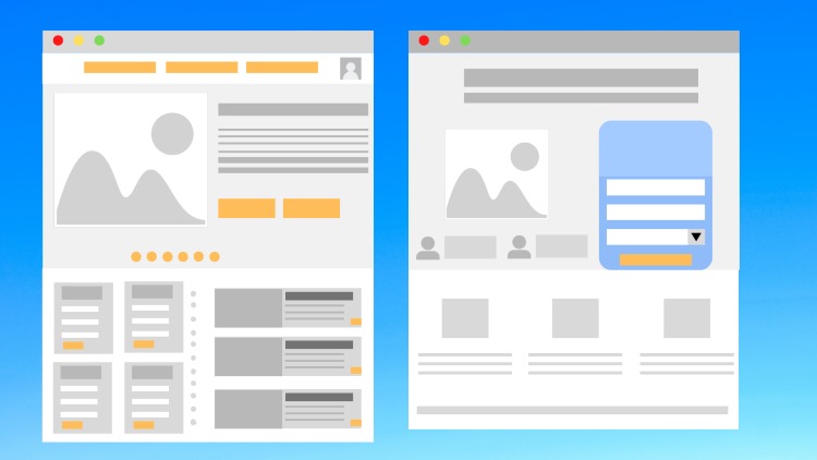
A common point of confusion for beginners is distinguishing between a landing page and a website’s homepage. While both are web pages, their purpose, structure, and intended user experience are fundamentally different. Understanding this difference is crucial for effective web strategy.
The primary difference lies in their objective. A homepage is the main entry point to your entire website. It serves multiple goals: introducing your brand, showcasing different products or services, providing company information, and directing users to various sections via navigation menus. Its focus is broad.
Conversely, a landing page has a single, sharply defined focus: to achieve one specific conversion goal tied to a marketing campaign. Whether it’s signing up for a webinar, downloading a guide, or purchasing a specific product, the entire page is geared towards that single action.
Navigation is another key differentiator. Homepages typically feature extensive navigation menus (header, footer, sometimes sidebars) to encourage exploration of the site. Landing pages, however, intentionally feature minimal navigation or often no navigation at all, apart from perhaps a link to privacy policies or terms.
Why remove navigation? To eliminate distractions. The goal is to keep the visitor focused solely on the offer and the Call to Action (CTA). Every link away from the main conversion goal is a potential exit point, reducing the chance the visitor will complete the desired action.
Traffic source expectations also differ. Visitors often arrive at a homepage through direct searches for the brand or general exploration. Visitors typically arrive at a landing page from a specific source like a Google Ad, an email link, or a social media post, expecting content directly related to that source.
Think of your homepage as the main lobby of your building, offering access to many different rooms (sections of your site). A landing page is like a dedicated express entrance leading directly to one specific room (the offer) for a special event (the marketing campaign).
Anatomy of an Effective Landing Page: Key Components
While designs vary, effective landing pages share common essential elements working together towards the conversion goal. Understanding these components helps in creating or evaluating landing pages. They form the building blocks of a high-converting page designed for a specific target audience.
Compelling Headline and Supporting Subheading
The headline is often the first thing a visitor reads. It must grab attention immediately and clearly communicate the main benefit or value proposition of the offer. It should also align closely with the message of the ad or link the visitor clicked (message match).
A strong headline might highlight a key benefit (“Effortlessly Double Your Email Open Rates”) or pose an intriguing question (“Is Your Website Losing You Customers?”). Below the main headline, a subheading can provide additional context, clarify the offer, or add persuasive detail, further engaging the visitor.
For example, a headline could be “Learn SEO Basics in 7 Days”. The subheading might add: “Download our free beginner’s guide and start optimizing your website today.” This combination clearly states the offer and the immediate benefit.
Clear Offer / Value Proposition
The core of the landing page is the offer – what the visitor receives in exchange for converting (e.g., providing contact info, making a purchase). This value proposition must be communicated with absolute clarity. Visitors should instantly understand what they get and why it’s valuable to them.
Avoid ambiguity. If offering an e-book, state it clearly. If promoting a discount, show the exact savings. The offer needs to be compelling enough to motivate action and directly address a need or desire of the target audience. This clarity is fundamental to achieving the page’s conversion goal.
For instance, an offer like “Get 20% Off Your First Order” is clear. An offer like “Improve Your Business” is too vague. The specific offer must be tangible and immediately understandable to drive the desired action on the landing page.
Engaging Visuals (Images or Video)
Relevant visuals – high-quality images, videos, or infographics – can significantly enhance a landing page’s effectiveness. They break up text, illustrate the offer or its benefits, build emotional connection, and make the page more engaging and easier to understand.
An image might show the product in use, the cover of an e-book, or happy customers. A video could provide a demo, a customer testimonial, or a more detailed explanation of the offer. Ensure visuals are high-quality, relevant, and don’t significantly slow down page loading time, which impacts user experience (UX).
For example, a landing page for a travel package would benefit greatly from stunning destination photos or a short video tour. A page offering software might use screenshots or a brief demo video. Visuals help visitors imagine the value they’ll receive.
Persuasive and Concise Copy
The text on the landing page (copy) needs to be persuasive yet concise. It should clearly explain the offer, highlight its key benefits (not just features), address potential visitor concerns, and guide them smoothly towards the Call to Action (CTA). Use clear, simple language.
Break up text using short paragraphs, bullet points, and bold text for scannability. Focus on how the offer solves a problem or fulfills a desire for the visitor. Adopt the tone of voice suitable for the target audience – often helpful, informative, and benefit-driven, aligning with HV1 research.
Think about using the AIDA model (Attention, Interest, Desire, Action) as a framework. Grab attention with the headline, build interest and desire by explaining benefits, and prompt action with a clear CTA. Keep sentences short and focused for better readability.
The All-Important Call to Action (CTA)
The Call to Action (CTA) is the specific instruction telling the visitor what to do next. It’s typically presented as a button (the CTA button) or a prominent link. Without a clear CTA, visitors may not know how to proceed, even if interested in the offer.
Your CTA must be action-oriented and specific. Use verbs like “Download Now,” “Get Started Free,” “Register for Webinar,” or “Shop the Sale.” Avoid vague phrases like “Submit” or “Click Here.” The CTA button design should stand out using contrasting colors and clear text.
Placement is also key; the CTA should be clearly visible, often appearing multiple times on longer pages. Ensure there is only one primary CTA related to the main conversion goal to maintain focus, especially on lead generation pages. Clarity here directly impacts the conversion rate.
Lead Capture Form (for Lead Generation Pages)
If the goal is lead generation (collecting contact information), a web form is essential. This component allows visitors to exchange their details (like name and email) for the offer (e.g., an e-book, webinar access, a quote).
The form itself should be easy to use. Only ask for information absolutely necessary for the offer or follow-up. Shorter forms generally have higher conversion rates because they require less effort. Clearly label each field and ensure the form works flawlessly on all devices.
Include a link to your privacy policy near the form to build trust. The design of the form should be clean and integrated well into the page layout, often positioned close to the main CTA button or explanation of the offer. This is central to lead capture strategy.
Trust Signals: Building Credibility
Trust signals are elements that build visitor confidence in your offer and brand. These are crucial because visitors are often hesitant to share information or make purchases online. Including social proof and credibility markers can significantly boost conversion rates.
Common trust signals include customer testimonials or reviews, logos of well-known clients or partners, awards or recognitions, security badges (like SSL certificates), money-back guarantees, or clear contact information. These elements reassure visitors that your offer is legitimate and trustworthy.
Strategically place these trust signals near the CTA or form, or where visitors might have doubts. For example, showing logos of companies using your software builds authority. Displaying positive customer quotes provides relatable social proof, reinforcing the value proposition.
Focused Design: The Power of Minimal Navigation
A defining characteristic of most effective landing pages is minimal navigation, or sometimes no traditional website navigation at all. This intentional design choice forces focus. Removing links to other pages (About Us, Blog, other Products) keeps visitors on the path towards the single conversion goal.
Every link is a potential leak in your marketing funnel. By creating a standalone page experience centered only on the specific offer, you maximize the chances of the visitor taking the desired action. This focused design is a core principle differentiating landing pages from standard website pages.
Exceptions might include links to essential information like a privacy policy or terms of service, often placed discreetly in the footer. The key is that the primary path forward should overwhelmingly point towards the main CTA. This maximizes the impact of your marketing campaign budget.
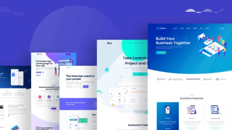
Common Types of Landing Pages Explained
While all landing pages share the goal of conversion, they can be broadly categorized based on their specific objective. Understanding these common types of landing pages helps you choose the right format for your marketing campaign. Let’s explore the two primary categories.
Lead Generation Landing Pages
As the name suggests, Lead Generation Landing Pages (often called “lead gen” pages) are designed primarily to capture leads – contact information from potential customers. The core component here is the web form. Visitors fill out the form in exchange for an offer.
This offer, known as a “lead magnet,” needs to provide sufficient value to entice visitors to share their details. Common examples include free e-books, checklists, templates, white papers, webinar registrations, free consultations, or discount codes. These pages fuel the top of the sales funnel.
The design focuses on highlighting the value of the lead magnet and making the form easy to complete. The CTA will typically relate directly to accessing the offer, such as “Download Your Free Guide” or “Register Now”. These are workhorses for building email lists and generating sales prospects.
Click-Through Landing Pages
Click-Through Landing Pages aim to persuade the visitor to click through to another page, usually a purchasing or registration page. They act as an intermediary step, warming up the visitor by providing key information and benefits before asking for a higher commitment like a purchase.
These are common in e-commerce and SaaS (Software as a Service) marketing funnels. For example, an ad promoting a specific product might lead to a click-through landing page detailing that product’s features and benefits, with a CTA like “View Product Details” or “Choose Your Plan,” leading to the main product or checkout page.
Unlike lead gen pages, they typically don’t have a form. Their goal is persuasion and setting expectations before the visitor reaches the transaction point. They bridge the gap between the initial ad click and the final conversion action, aiming to increase the likelihood of that final step by providing focused information.
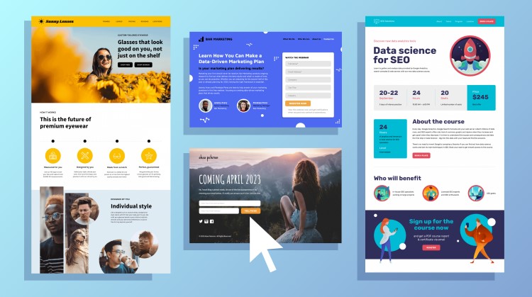
Landing Pages in Action: Real-World Examples
Theory is helpful, but seeing landing pages in action clarifies their role. Imagine these common scenarios where landing pages are the crucial link between initial interest and desired conversion, directly supporting marketing campaign goals across different channels.
Consider a PPC campaign using Google Ads. You bid on keywords like “project management software.” When someone clicks your ad, they shouldn’t land on your generic homepage. Instead, they reach a landing page dedicated only to your software, highlighting its benefits for project managers, possibly showing a demo video, and featuring a clear CTA like “Start Free Trial”.
Think about email marketing. You send an email promoting a limited-time 30% discount on a specific online course. Clicking the link in the email takes the recipient to a landing page. This page echoes the email’s message, details the course content, reinforces the discount, and provides a prominent “Enroll Now” CTA button.
Imagine a social media marketing effort on Facebook. You run an ad targeting small business owners with a free guide on “Local SEO Tips”. Clicking the ad leads to a lead generation landing page. It explains the guide’s value, shows a preview or testimonials, and presents a simple form to download the guide in exchange for an email address.
Or consider a webinar registration. Promoting it via LinkedIn? The link leads to a dedicated landing page. This page details the webinar topic, introduces the speakers, lists the date and time, explains what attendees will learn (value proposition), and has a clear form and CTA to “Register for the Webinar”.
In each example, the landing page acts as a focused, persuasive environment directly related to the source traffic and designed solely to achieve that specific conversion goal. This alignment and focus are why they are much more effective than sending campaign traffic to a general homepage.
Ready to Use Landing Pages? Next Steps
Now that you understand what a landing page is, its core purpose, key components, and common types, you can see their immense value in any digital marketing strategy. They are essential tools for maximizing the return on your marketing campaign investments by driving focused conversions.
If you’re ready to implement them, the good news is you don’t necessarily need advanced coding skills. Numerous landing page builder platforms exist specifically to help create, publish, and test landing pages easily. Popular examples include Leadpages, Unbounce, Instapage, and HubSpot’s landing page tool.
These platforms often provide templates and drag-and-drop interfaces, making design accessible. They also usually include features for A/B testing – a crucial practice where you create variations of your page (e.g., different headlines or CTA buttons) and test them against each other to see which performs better.
A/B testing is part of Conversion Rate Optimization (CRO) – the ongoing process of improving your pages to get more conversions from the same amount of traffic. Continuously testing and refining elements like your headline, offer, copy, and CTA is key to long-term landing page success.
So, the next step after understanding the “what” and “why” is exploring the “how”. Investigate landing page builder options that fit your needs and budget. Start planning your first landing page around a specific marketing campaign goal, keeping the principles of focus, clarity, and a strong Call to Action top of mind.
Conclusion: The Power of Focused Conversion
In summary, a landing page is far more than just another page on your website. It’s a purpose-built tool designed for a single, focused conversion goal, acting as the crucial link in specific marketing campaigns. By understanding and effectively utilizing landing pages, businesses can dramatically improve their online results.
Remember the key takeaways: landing pages provide focus, differ significantly from homepages (especially in navigation and objectives), rely on essential components like strong headlines and clear CTAs, come in different types (like lead gen and click-through), and are vital for maximizing conversion rates from targeted traffic sources like PPC or email. Embrace their power to transform your marketing effectiveness.
Just as landing pages need careful design for conversion, their speed and reliability heavily depend on the underlying hosting foundation. For a stable, high-performance solution, consider Vietnam VPS, utilizing new-gen dedicated hardware like AMD EPYC Gen 3 processors and NVMe U.2 SSDs for high speed, optimized capacity, and high bandwidth from a reputable provider.