Ever wondered about that ‘Contact Us’ link you see on almost every website? That leads to the contact page, a standard and essential part of any online presence. Simply put, it’s a dedicated page where visitors can easily find ways to get in touch with the person or organization behind the site. This guide explains what a contact page is, why it’s so important, and what key information it should contain.
What is a Contact Page?
A Contact Page is a standard web page found on most websites that provides visitors with the means to communicate with the site owner, business, or organization.
Its primary purpose is to offer various ways for people to get in touch. Typically, a contact page includes elements like:
- A contact form (for sending messages directly through the site)
- Email address(es)
- Phone number(s)
- A physical address and often a map (especially for businesses with a physical location)
- Links to social media profiles
Why is a Contact Page Important for Your Website?
A contact page is much more than just a listing of details; it serves multiple vital purposes. It acts as a crucial bridge, connecting your website visitors with you or your organization. Neglecting this page means missing out on valuable interactions and opportunities online.
Its presence and quality significantly impact how users perceive your website and your business or personal brand. Let’s explore the key reasons why having an effective contact page is so important for success in the digital space, contributing directly to achieving your website’s goals.
Enabling Communication & Support
The most fundamental purpose of a contact page is to facilitate communication. It provides clear, designated communication channels for visitors to ask questions about products, services, content, or anything else related to your website. This accessibility is key for a positive user interaction.
Furthermore, it serves as a vital gateway for customer support. When existing customers or users encounter issues or need assistance, the contact page should guide them quickly to the help they need. This direct line prevents frustration and helps maintain good customer relationships.
Imagine a user encountering an error while trying to make a purchase. A readily available contact page with a support email or phone number can turn a potentially lost sale into a resolved issue and a satisfied customer, highlighting its importance in user retention.
This open channel allows visitors to easily inquire about specifics not covered elsewhere on the site. For instance, someone might need details about international shipping for a product, or clarification on a service offering before committing, making easy contact essential.
Building Trust & Credibility
In the online world, trust is paramount. A readily accessible contact page with clear, accurate information acts as a powerful trust signal. It shows visitors that there’s a real, reachable entity behind the website, not just an anonymous online front.
Providing multiple ways to get in touch, including potentially a physical address for businesses, reinforces legitimacy. This transparency makes visitors feel more secure when interacting with your site, whether they are considering a purchase, sharing information, or seeking collaboration. This aligns with Google’s E-E-A-T principles, emphasizing trustworthiness.
Conversely, a website lacking a contact page, or one with hidden or outdated information, can appear suspicious or unprofessional. This lack of transparency can deter potential customers or collaborators who value accountability and easy communication before engaging further with a brand or individual online.
Think about your own experiences. You likely feel more comfortable engaging with a business online if you know you can easily contact them should an issue arise. This psychological safety net provided by a good contact page is crucial for building lasting relationships.
Generating Leads & Opportunities
For businesses, the contact page is a critical tool for lead generation. When potential customers are interested in your products or services after Browse your site, the contact page provides the mechanism for them to take the next step and express their interest formally.
Whether through a contact form, a direct sales email, or a phone number, this page captures inquiries from prospects. These inquiries represent valuable opportunities to engage with potential clients, understand their needs, provide quotes, and ultimately convert interest into sales or partnerships.
Beyond direct sales leads, the contact page can attract other opportunities. Potential business partners, investors, advertisers, or media representatives often use the contact page to initiate discussions. Making it easy for these valuable contacts to reach you is essential for growth and networking.
Consider a freelance graphic designer’s portfolio website. A potential client impressed by their work uses the contact form to inquire about project rates. This interaction, facilitated by the contact page, could lead to a significant new project for the freelancer.
Gathering Valuable Feedback
A contact page also serves as an important channel for gathering user feedback. Visitors might use it to report website errors, suggest improvements for products or services, or share their overall experience with your brand or content. This direct input is invaluable.
This user feedback mechanism provides insights that might not surface through other channels. Analyzing messages received via the contact page can help identify user pain points, areas for website optimization, or ideas for new features or content, contributing to continuous improvement.
Encouraging feedback, perhaps even explicitly stating on the page that suggestions are welcome, can foster a sense of community and show users that their opinions are valued. This not only helps improve your offerings but also strengthens user relationships by making them feel heard.
What Information Should Be on a Contact Page? Key Elements
To be effective, a contact page needs to provide the right information clearly and concisely. While the exact details depend on the nature of the website (e.g., personal blog vs. large e-commerce store), certain key elements are commonly found and generally expected by users.
Accuracy and clarity are paramount for all listed information. Outdated phone numbers or unmonitored email addresses lead to frustration and damage the trust you aim to build. Let’s break down the essential components that make up a comprehensive and user-friendly contact page.
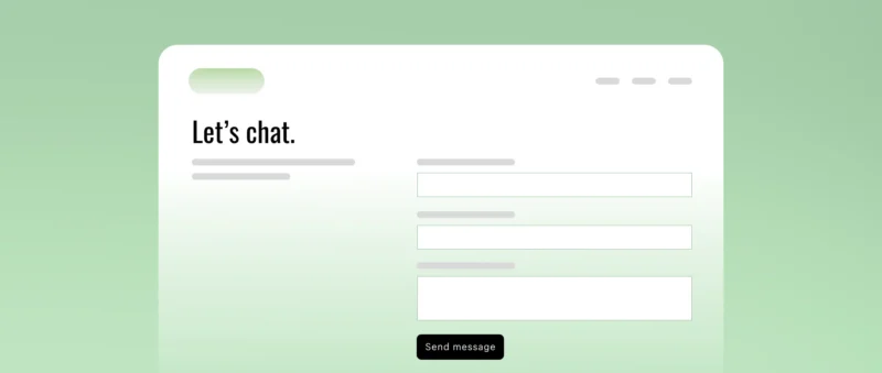
Contact Form
A contact form is perhaps the most common element. It offers a structured way for visitors to send a message directly through your website without needing to open their own email client. This convenience often increases the likelihood of users reaching out.
From the website owner’s perspective, forms provide structured information. You can define the specific fields you need (like name, email, subject, message), ensuring you receive the necessary details to respond effectively. This is often more organized than managing inquiries via a generic email inbox.
Keep your contact form simple. Only ask for essential information. Typically, this includes:
- Name: To know who is contacting you.
- Email Address: Crucial for replying to the inquiry.
- Message: The main text area for the visitor’s question or feedback.
Avoid adding too many fields, as each additional field can decrease the form’s completion rate. Requesting information like address or company size might be relevant for specific business leads but could deter general inquiries if not necessary for the initial contact.
The submit button on the form should have a clear and actionable label, such as “Send Message,” “Submit Inquiry,” or “Get In Touch,” rather than a vague term like “Submit.” This clarifies the button’s function for the user immediately.
After a user submits the form, it’s crucial to provide immediate feedback. Display a confirmation message on the page (e.g., “Thank you! Your message has been sent.”) or redirect to a dedicated “Thank You” page. This reassures the user their submission was successful.
It’s also best practice to indicate the expected response time within this confirmation message (e.g., “We typically respond within 24 business hours.”). This manages user expectations effectively and demonstrates professionalism, contributing positively to the user experience.
If your form collects personal information (like name and email), you must consider data privacy. Include a link to your website’s Privacy Policy near the form. This informs users how their data will be handled and builds trust, which is essential under regulations like GDPR.
Contact forms are often targets for spam bots. Implementing spam protection is necessary. Common methods include CAPTCHA tests (like reCAPTCHA’s “I’m not a robot” checkbox) or “honeypot” fields (hidden fields that bots fill but humans don’t), helping filter out automated junk submissions.
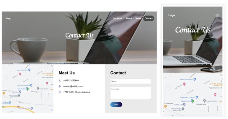
Direct Contact Details (Email & Phone)
While forms are convenient, some users prefer direct contact methods. Providing a clickable email address (using a mailto: link) allows users to easily open their email client and compose a message. This can feel more direct or allow for easier attachment sharing.
Consider using role-based email addresses (e.g., support@yourdomain.com, sales@yourdomain.com) if applicable, rather than personal ones. This looks more professional and helps route inquiries to the correct department or person within your organization, improving efficiency.
Listing a phone number provides an immediate channel for users who prefer speaking directly or have urgent inquiries. Make sure the phone number is clickable (tel: link) so mobile users can easily initiate a call directly from the webpage.
If you have different departments, providing specific phone numbers (e.g., for Sales, Customer Support, Press Inquiries) can help streamline communication further. Ensure these numbers are clearly labeled so users know which one is appropriate for their specific need.
Providing both a form and direct contact details caters to different user preferences and communication styles. Some value the structure of a form, while others prefer the directness of email or the immediacy of a phone call, offering choice improves accessibility.
Physical Address & Map (If Applicable)
For businesses with a physical presence (like a retail store, office, restaurant, or service center), including the full physical address is essential. This information is critical for customers who intend to visit your location in person.
Listing a physical address also significantly boosts credibility and trust, even for online businesses. It demonstrates that you are a legitimate entity with a real-world presence, making potential customers feel more secure about engaging with you or making purchases.
Complementing the address with an embedded map (commonly using Google Maps) is highly recommended. A visual map helps users easily locate your business, understand its surroundings, and plan their visit or get directions without needing to leave your website.
For Local SEO (Search Engine Optimization), having your accurate Name, Address, and Phone number (NAP) consistently listed on your contact page and elsewhere online is crucial. Search engines use this information to verify your business and rank it in local search results.
Business Hours (If Applicable)
If your business has specific operating hours, or if customer support is only available during certain times, clearly listing these business hours on the contact page is vital. This manages visitor expectations effectively and prevents frustration.
Users need to know when they can expect to reach someone by phone, when they can visit your physical location, or when they are likely to receive a response to an email or form submission. Providing this information upfront shows consideration for the user’s time.
Ensure the listed hours are accurate and include the relevant time zone if your audience is geographically diverse. This simple piece of information prevents misunderstandings and improves the overall customer service experience provided through your website.
Social Media Links
Include links or icons directing visitors to your active social media profiles (such as Facebook, Twitter, LinkedIn, Instagram, etc.). This offers users alternative ways to connect, engage with your brand, and stay updated on your activities or announcements.
Social media can also serve as an additional customer support channel for some businesses. Linking to these profiles from your contact page ensures users are aware of all available avenues for interaction and support, catering to diverse communication preferences found online today.
Choose only the platforms where you are genuinely active and responsive. Linking to inactive or neglected profiles can create a negative impression. Ensure the icons or links are easily recognizable and lead directly to the correct official profiles associated with your website or brand.
Making Your Contact Page Easy to Find
Even the most well-designed contact page is ineffective if visitors cannot easily locate it. Findability is a key aspect of User Experience (UX). Users expect contact information to be accessible without having to hunt through the entire website.
Frustration often arises when contact details are buried or hard to find. Ensuring easy access demonstrates customer focus and professionalism. There are standard conventions for placing contact page links that most users are familiar with from their web Browse experiences.
Standard Website Location
The most common and recommended places to link to your contact page are within the main website navigation menu, typically located in the website header (often as one ofsaltast menu items, possibly on the right side), and also in the website footer.
Placing the link in the header ensures it’s visible on nearly every page of your site as users navigate. Including it in the footer provides another consistent access point, especially for users who scroll to the bottom of a page looking for contact or company information.
Clear Link Text
Use clear, standard, and intuitive text for the link itself. Phrases like “Contact” or “Contact Us” are universally understood and expected by users. Avoid overly creative or ambiguous labels like “Say Hello,” “Let’s Chat,” or “Reach Out.”
Using familiar terminology aligns with usability principles (like Jakob’s Law, which states users prefer sites to work like others they already know). Simple, direct language reduces cognitive load and makes navigation effortless for all visitors, including those using assistive technologies or non-native speakers.