Ever clicked “Submit,” “Login,” or even a tiny icon to make something happen on a website or app? Chances are, you’ve interacted with a button! These small elements are the unsung heroes of the digital world. They act as bridges, allowing us to communicate our intentions to complex systems with a simple click.
But what exactly is a button in this technological context? Why is this seemingly minor component so crucial for our online experiences? If you’re curious about the basics of User Interface (UI) buttons, their many forms, and how they empower us to navigate and utilize technology effectively, you’re in the right place. Let’s click in and explore the fascinating world of buttons together!
What is a Button in Tech?
In technology, a button is an interactive graphical control element that users click or tap to trigger a specific action or event within a digital interface. This interface could be on a website, in a software application, or on your mobile device. Buttons are foundational to modern computing.
Buttons are a core component of a Graphical User Interface (GUI). A GUI is a type of user interface that allows users to interact with electronic devices through visual indicators and graphical icons, as opposed to text-based commands. Think of your desktop, with its icons and windows.
Imagine a physical button, like a doorbell or a light switch. You press it, and something happens – the bell rings, or the light turns on. Digital buttons in software and on websites function in a very similar, intuitive way. They make complex operations simple.
These elements are fundamental for interaction. They tell a computer or a program what you want it to do next. Without buttons, navigating websites or using applications would be incredibly difficult and far less intuitive for most users. They simplify complex commands into single interactions.
Their design often gives clues about their function. For instance, a button labeled “Play” with a triangle icon clearly indicates it will start a video or audio. This visual language is key to user understanding and ease of use.
Why Are Buttons So Important?
Buttons are critically important because they are the primary means by which users interact with and control digital products. They translate a user’s intention into a command that the system can understand and execute, making technology accessible and functional.
One key function is triggering actions. When you click a “Save” button, your work is stored. A “Download” button initiates a file transfer. These action-oriented buttons are workhorses, performing countless tasks in our digital lives seamlessly. Consider an e-commerce site.
The “Add to Cart” button is a prime example of an action trigger. Similarly, a “Send” button in your email application dispatches your composed message. Photo editing software might have an “Apply Filter” button to modify an image instantly.
Buttons are also essential for navigation. Think of “Next” and “Previous” buttons in an online article or a photo gallery. A “Home” button often returns you to the main page of a website. These guide users through different sections of content.
Website menus might use buttons to take you to different pages like “About Us” or “Contact.” In a multi-step process, like a checkout flow, “Continue” or “Back” buttons are crucial for moving between stages smoothly and logically.
Furthermore, buttons help users make choices. A common example is a dialog box asking, “Are you sure you want to delete this file?” with “Yes” and “No” buttons. These allow users to confirm decisions or cancel operations.
When installing software, you often encounter buttons like “Accept” for terms and conditions. Pop-up notifications on your phone might offer “Dismiss” or “View” buttons, allowing you to decide how to proceed with the information presented.
A particularly vital role is played by Call-to-Action (CTA) buttons. These are specifically designed to prompt the user towards a desired outcome, such as “Sign Up Free,” “Request a Demo,” or “Shop Now.” CTAs are pivotal for conversions.
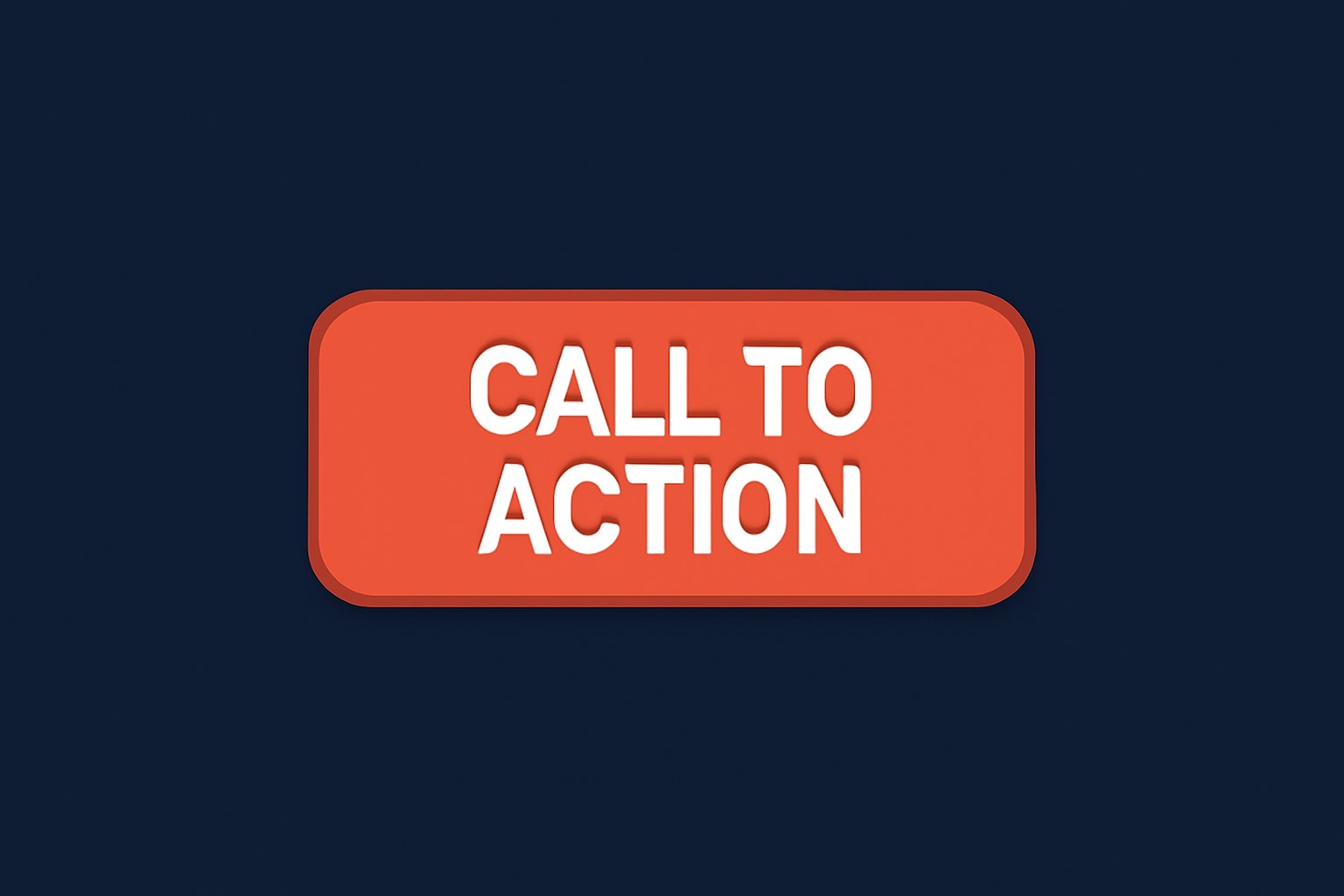
CTAs are often visually prominent to attract attention. Their effectiveness can significantly impact business goals. For example, a well-placed “Subscribe to Newsletter” button can greatly increase a website’s subscriber base, directly impacting marketing efforts.
The presence and design of buttons profoundly impact the User Experience (UX). UX refers to a person’s overall experience when using a product, especially in terms of how easy or pleasing it is to use. Good buttons enhance UX.
Clear, intuitive buttons make software and websites easier to learn and navigate. This reduces frustration and allows users to accomplish their tasks efficiently. Poorly designed buttons, on theother hand, can lead to confusion and a negative user experience.
They guide the user flow, which is the path a user takes through an application or website to complete a task. For example, in an online learning platform, buttons might guide a student from selecting a course to watching lectures and taking quizzes.
The Anatomy of a Button: What Makes Them Tick (and Click)?
Understanding what constitutes a button involves looking at its various characteristics. These elements work together to communicate its function and interactivity to the user, ensuring it’s both recognizable and usable. Effective buttons are carefully designed.
Visual Cues: More Than Just a Pretty Shape
The visual aspects of a button are the first things a user notices. These cues signal that an element is interactive and provide hints about what it does. They are critical for immediate understanding.
A label is often the most important visual cue. This is typically text or an icon that describes the button’s action. Clear, concise labels are essential. For example, “Submit” is much clearer than a vague term.
Text labels should be action-oriented, like “Create Account” or “View Details.” Icons, such as a magnifying glass for “Search” or a trash can for “Delete,” are also common. Sometimes, text and an icon are combined for enhanced clarity.
The shape and size of a button also contribute to its usability. Most buttons are rectangular or have rounded corners, shapes that users readily associate with clickability. Circles are also used, especially for icons or Floating Action Buttons.
Size is particularly crucial on touchscreens. Design guidelines, such_as Apple’s Human Interface Guidelines (HIG) or Google’s Material Design, recommend minimum tap target sizes (e.g., 44×44 points for iOS) to ensure users can tap them accurately without frustration.
Color and style play a significant role in a button’s visibility and perceived importance. Color can draw attention, indicate function (e.g., red often signals a destructive action like “Delete”), or align with brand identity. Consistent styling is key.
For instance, a primary action button might use a bright, contrasting color to stand out. Secondary actions might use more subdued colors or an outline style. This visual hierarchy guides the user’s attention to the most important actions first.
Affordance is a design term meaning the visual properties of an object that suggest how it can be used. For buttons, affordance means they look clickable. This is often achieved through shadows, borders, or raised appearances.
A button with a slight shadow, for example, appears to be slightly lifted from the page, inviting a “press.” This subtle cue, rooted in our interaction with physical objects, makes digital interfaces more intuitive and user-friendly.
Button States: A Button’s Different “Moods”
Buttons change their appearance based on user interaction. These different appearances are called “states,” and they provide crucial visual feedback to the user, confirming that the system is responding to their actions. Each state has a purpose.
The Default or Normal state is how a button appears before any interaction, when it’s simply available to be clicked. It should clearly communicate its primary function and be readily identifiable as an interactive element on the page.
For example, a “Login” button on a website will sit in its default state, waiting for a user to initiate the login process. Its design in this state should be clear and inviting.
The Hover state is activated when a user moves their mouse cursor over the button (on non-touch devices). The button typically changes appearance slightly, perhaps with a color change or by becoming brighter, signaling it’s interactive.
This subtle visual feedback reassures the user that the element is indeed a button and is ready to be clicked. For example, a download button might subtly change its background color when you hover over it.
The Active or Pressed state occurs at the moment the user clicks or taps the button. The button often appears to be pushed down or changes color more dramatically. This confirms the click has been registered by the system.
Imagine clicking a “Send” button for an email. The brief visual change as you click provides immediate confirmation that your action has been received, even before the email actually sends. This is vital feedback.
The Disabled state indicates that a button is temporarily inactive and cannot be clicked. It usually appears “grayed out” or faded. This state tells the user that certain conditions must be met before the button becomes functional.
For example, a “Submit” button on a form might remain disabled until all required fields are filled in. This prevents errors and guides the user through the necessary steps to complete the form correctly.
The Focused state is important for accessibility and keyboard navigation. When a user navigates to a button using the Tab key on their keyboard, the button receives “focus” and is typically highlighted with an outline or distinct visual cue.
This allows users who cannot use a mouse to clearly see which element is currently selected and ready to be activated with the Enter or Spacebar key. This state is crucial for inclusive design.
An optional Loading state can be used when a button’s action takes time to complete. The button might display a spinner icon or a message like “Processing…” This informs the user that the system is working.
For example, after clicking a “Pay Now” button, it might change to a loading state while the payment is being processed. This feedback prevents the user from clicking multiple times or thinking the system has frozen.
Not All Buttons Are Created Equal: Exploring Common Types
Buttons come in a vast array of styles and serve many different functions. Understanding these common types can help you recognize their purpose and how they contribute to the overall user experience across various digital platforms.
Buttons Based on What They Do (Function)
The function of a button is its primary defining characteristic. What action does it perform? This often dictates its label and placement within an interface. Several key functional types exist.
- Submit Buttons are most commonly found in forms. Their purpose is to send the data entered by the user to a server for processing. Examples include “Login,” “Register,” “Send Message,” or “Place Order.” When you fill out a contact form on a website and click “Submit,” that button is sending your information to the site owner. In online banking, a “Transfer Funds” button finalizes the transaction data you’ve entered.
- Reset Buttons, also typically found in forms, allow users to clear all entered data and revert the form fields to their initial state. However, they should be used cautiously as accidental clicks can be frustrating. For instance, if you’re filling out a long application form and mistakenly click “Reset,” all your progress could be lost. Due to this potential frustration, many modern interfaces avoid reset buttons or require confirmation.
- Call-to-Action (CTA) Buttons are designed to guide users towards a specific, often conversion-oriented, goal. They use compelling language like “Sign Up Free,” “Download Now,” “Get Started,” or “Shop Our Sale.” A software company’s website might feature a prominent “Request a Demo” CTA button. An e-commerce product page will heavily feature an “Add to Cart” or “Buy Now” CTA to encourage purchases from visitors.
- Toggle Buttons switch a setting or feature between two or more states, such as on/off or show/hide. They often visually indicate the current state. Examples include a mute button or a dark mode toggle. Your smartphone’s Wi-Fi or Bluetooth buttons in the control panel are toggle buttons. A “Show Password” icon next to a password field that changes to “Hide Password” is another common example of this type.
- Navigation Buttons help users move between different sections, pages, or steps within an application or website. Common labels include “Next,” “Previous,” “Back,” “Home,” or page numbers for pagination. In a multi-page survey, “Next” and “Previous” buttons allow you to move between questions. The back arrow in your web browser is a quintessential navigation button, taking you to the last page you visited.
- Icon Buttons use a graphical symbol instead of text to represent their action. This saves space and can be quickly recognized if the icon is universally understood. Common examples include a trash can for delete or a magnifying glass for search. A music player app will typically use play (triangle), pause (two vertical bars), and skip (triangles with a bar) icon buttons. However, ambiguity can arise if icons are not clear, so sometimes a text label is paired with an icon.
Buttons Based on How They Look (Style)
The visual style of a button influences its prominence and how it fits into the overall design aesthetic of an interface. Designers choose styles based on hierarchy, brand, and desired user perception.
Text Buttons (also known as “basic buttons”) are essentially clickable text labels without a distinct background fill or border. They are often used for less prominent actions or when a cleaner, more minimalist look is desired, like in toolbars or dialog footers.
For example, in a Google Docs menu, options like “File” or “Edit” might behave like text buttons. The “Cancel” option in a dialog box is often a text button to de-emphasize it compared to the primary action.
Contained Buttons (or “Raised Buttons” in Material Design) have a solid background color and often a slight shadow, making them appear elevated from the surface. They are typically used for high-emphasis actions due to their prominence.
A primary CTA like “Sign Up” on a landing page is often a contained button to make it stand out. The main action in a dialog, such as “Save Changes,” would also likely be a contained button.
Outlined Buttons (or “Ghost Buttons”) have a transparent background with a visible border. They are generally used for medium-emphasis actions, providing an alternative to contained buttons that is less visually dominant but still clearly interactive.
If a primary action is a contained button, a secondary action like “Learn More” or “View Details” might be an outlined button. This provides a clear visual hierarchy between different levels of actions on the page.
Floating Action Buttons (FABs), popularized by Google’s Material Design, are circular buttons, typically with an icon, that float above other UI elements. They represent the primary, most common action on a screen.
In a note-taking app, a FAB might be used to “Create a New Note.” In an email app, it could be for “Compose New Email.” Their floating nature ensures they are always accessible and prominent.
Buttons Based on Importance (Hierarchy)
Visual hierarchy helps users quickly identify the most important actions on a screen. Buttons are often styled differently to reflect their level of importance, guiding the user’s attention and decision-making process effectively.
Primary Buttons represent the main or most critical action in a particular context. They should be visually dominant, often using a strong background color or prominent placement to attract the user’s attention immediately.
On an e-commerce checkout page, the “Complete Purchase” or “Pay Now” button is the primary button. In a modal dialog asking for confirmation, the “Confirm” or “Yes” button is typically the primary one.
Secondary Buttons offer an alternative, less important action compared to the primary button. They are styled to be less prominent, perhaps using an outline style or a more subdued color, so they don’t compete for attention.
If “Save” is the primary button in a settings panel, a “Cancel” or “Reset to Defaults” option might be presented as a secondary button. This guides users towards the most likely action while still providing alternatives.
Tertiary Buttons are used for the least prominent actions. They often appear as simple text buttons or very subtle links. Their design minimizes visual clutter while still providing access to less frequently used options.
In a list of items, an “Edit” or “Delete” option next to each item might be a tertiary button. Footer links like “Privacy Policy” or “Terms of Service” can also be considered tertiary interactive elements.
Destructive Buttons indicate an action that will result in data loss or another significant, often irreversible, consequence. They are usually styled distinctly, often in red or with a warning icon, to alert the user to the potential impact.
A “Delete Account” button is a classic example of a destructive action. Similarly, “Discard Changes” or “Remove Item” buttons should clearly signal their destructive nature to prevent accidental data loss. Often, these are paired with confirmation dialogs.
Where Do You Click? Buttons in Their Natural Habitats
Buttons are ubiquitous in the digital world, appearing in nearly every type of interface we use. Understanding their context helps appreciate their versatility and the specific roles they play across different platforms and applications.
Websites and Web Applications are prime environments for buttons. They facilitate everything from simple navigation (“Home,” “About Us”) to complex interactions like submitting forms (“Contact Us,” “Login”), e-commerce (“Add to Cart,” “Checkout”), and controlling web app features.
Modern web development relies heavily on technologies like HTML (HyperText Markup Language) to structure buttons (using elements like <button> or <input type="button">), CSS (Cascading Style Sheets) to style their appearance, and JavaScript to define their interactive behavior and what happens upon a click.
Software Applications on your desktop or laptop also heavily feature buttons. Operating systems themselves use buttons for managing windows (“Close,” “Minimize”), launching programs, and adjusting settings. Individual applications have their own sets of buttons for their specific functionalities.
For example, word processors have buttons for “Save,” “Print,” and formatting options like “Bold” or “Italic.” Graphics editing software uses buttons for tools like “Crop,” “Rotate,” or selecting different brushes and effects.
Mobile Applications (Apps) on smartphones and tablets are designed around touch interaction, making buttons even more critical. From navigating between screens to performing app-specific actions like “Post Photo,” “Send Message,” or “Play Game,” buttons are central.
Mobile operating systems like iOS and Android have their own design guidelines for buttons (e.g., Apple’s Human Interface Guidelines, Google’s Material Design) to ensure consistency and usability within their respective ecosystems. This includes recommendations for tap target sizes and common button placements.
Dialog Boxes and Modals frequently use buttons to prompt users for a decision or confirmation. These pop-up windows often present a specific question or piece of information and require a button press like “OK,” “Cancel,” “Yes,” “No,” or “Save Changes” to proceed.
For instance, if you try to close a document without saving, a dialog box might appear asking, “Do you want to save your changes?” with “Save,” “Don’t Save,” and “Cancel” buttons. This ensures users don’t accidentally lose important data.
Buttons in Action: Everyday Examples You’ll Recognize
Let’s walk through a few common scenarios where buttons play a starring role, making digital tasks possible and often seamless. These examples highlight how integral buttons are to our daily online activities.
Imagine you’re shopping online. You browse products, and when you find something you like, you click the “Add to Cart” button. This action adds the item to your virtual shopping basket. You might then click a “View Cart” button.
Once in your cart, you might adjust quantities using small “+” or “-” icon buttons. When ready, you click “Proceed to Checkout.” Each step involves buttons: filling forms and clicking “Continue,” selecting shipping with a radio button (a type of choice control), and finally, the crucial “Place Order” or “Pay Now” button.
Consider posting on social media. You tap a “+” or “Create Post” button (often a FAB on mobile). You type your message, perhaps tap an icon button to add a photo or video. You might then tap a “Tag Friends” button. Finally, you hit the “Post” or “Share” button to make your content live.
Or think about using a music streaming app. You search for an artist and tap on their name (which acts like a button). You see a list of songs and tap the play icon button next to a song title. Buttons allow you to pause, skip tracks, add songs to playlists (“Add to Playlist” button), or like a song (heart icon button).
Even a simple task like logging into your email involves buttons. You enter your email address and password into text fields, then click the “Login” or “Sign In” button. If you’ve forgotten your password, you’d click a “Forgot Password?” link or button to initiate the recovery process.
Quick Tips for Understanding & Spotting Good Buttons
While we use buttons constantly, recognizing what makes a “good” button can enhance your understanding of user-friendly design. Good buttons make interactions smooth and intuitive, while poorly designed ones can cause confusion.
A fundamental quality is clarity. A good button clearly communicates what will happen when you click it. Its label (text or icon) should be unambiguous and action-oriented. You shouldn’t have to guess its function. “Save Settings” is much better than just “Go.”
Effective buttons provide immediate feedback. When you click or tap a button, there should be a visual change (like its active state) to confirm the system has registered your input. This prevents uncertainty and repeated clicks.
Accessibility is crucial. Good buttons are designed to be usable by everyone, including people with disabilities. This means ensuring sufficient color contrast, providing clear focus indicators for keyboard navigation, and having appropriate ARIA (Accessible Rich Internet Applications) labels for screen readers.
Furthermore, buttons should have an adequate target size, especially on touchscreens. Trying to tap a tiny button can be frustrating. Design guidelines often suggest minimum dimensions to ensure they are easy and accurate to press without errors.
Consistency in button design within an application or website is also key. Users learn to recognize button styles and placements. If buttons for similar actions look and behave differently across various screens, it can lead to confusion and a disjointed experience.
Conclusion
So, what is a button? It’s far more than just a clickable shape on your screen. It’s a fundamental gateway to interaction in the digital realm, a simple yet powerful tool that allows us to command complex systems with remarkable ease. From navigating vast websites to performing critical actions in applications, buttons are indispensable.
They are the workhorses of user interfaces, thoughtfully designed to be intuitive, responsive, and helpful. Understanding their types, characteristics, and the importance of their design helps us appreciate the intricate thought that goes into making our digital experiences smoother and more efficient. The next time you click, you’ll have a deeper appreciation for that humble button and the key role it plays.
Frequently Asked Questions (FAQs)
Q1: What’s the main difference between a button and a link? A button typically triggers an action (like submitting a form or saving data), while a link (hyperlink) primarily navigates the user to a new page, a different section of the current page, or an external resource. However, their appearances can sometimes blur, and buttons can also be used for navigation.
Q2: How are buttons created for websites? Web buttons are primarily created using HTML elements like <button> or <input type="button">. Their appearance (color, size, shape, states) is then styled using CSS. JavaScript is often added to define what happens when the button is clicked, handling the interactive logic.
Q3: Why do some buttons look different from others? Buttons look different due to styling choices made by designers. This variation can be for branding (to match a company’s visual identity), to indicate hierarchy (primary vs. secondary actions), to enhance usability, or to fit the overall aesthetic of the website or application.
Q4: Can a button just be an icon? Yes, a button can consist solely of an icon, especially when space is limited or the icon’s meaning is universally understood (like a play symbol or a trash can). These are called icon buttons and are common in toolbars and mobile interfaces.