Ever wondered about the skeletal blueprints behind your favorite websites and apps? In this guide, we’ll break down exactly what a wireframe is, why it’s so important in the world of digital design, and how understanding it can benefit anyone involved in creating or even just using websites and apps.
What is a Wireframe?
A wireframe provides a clear, simplified view of a digital product’s layout. It focuses on what elements are present and where they are placed. This includes navigation, content areas, and key user interface (UI) components, stripped of any styling like colors or specific fonts.
It visually represents the underlying information architecture (IA) – how content is organized and structured. By focusing purely on this framework, designers and stakeholders can evaluate the core structure without distraction. This ensures the fundamental layout effectively supports user goals and business objectives early on.
Why are Wireframes So Important in Design?
Wireframes are critically important because they provide a foundational plan that guides the entire design and development process. They translate abstract ideas and requirements into a tangible, visual format. This early planning phase offers numerous significant benefits for the project team and outcome.
Using wireframes saves considerable time and resources by identifying potential issues early. They facilitate clear communication among team members and stakeholders. Furthermore, they ensure the design remains focused on usability and user needs from the very beginning, leading to a better final product.
Building a Strong Foundation for Your Website or App
Wireframes establish the core layout design and website structure (or app structure). Just like a building needs a solid foundation, a digital product needs a well-planned structure to function effectively. This structural planning ensures logical organization and placement of all elements.
This stage helps define the visual hierarchy – guiding the user’s eye to the most important information first. By deciding where navigation, key content, and calls-to-action are placed, wireframes create a robust framework upon which the rest of the design can be confidently built.
Consider an e-commerce product page. The wireframe would define where the product image gallery sits, where the description and specifications are located, the placement of the price, and the position and prominence of the “Add to Cart” button, establishing the core structure early.
Planning the User Journey Seamlessly
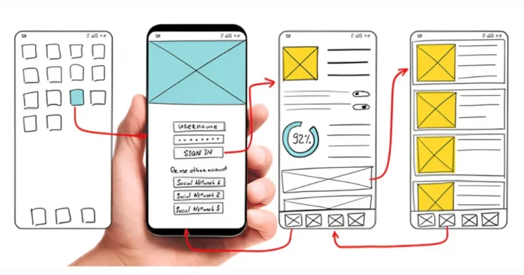
Wireframes are essential tools for planning the user flow or user journey. They help designers visualize how a user will navigate through the website or app to complete specific tasks. This involves mapping out screens and the connections between them via navigation menus and buttons.
For example, a wireframe series might show the steps for user registration: landing page -> click “Sign Up” button -> registration form screen -> submit form -> confirmation screen. Mapping this flow early helps identify potential dead ends or confusing navigation paths before development begins.
By focusing on navigation design within the wireframe, teams can optimize the user’s path. Is the main menu clear? Are important links easily accessible? Can users easily find their way back? Addressing these questions during wireframing leads to a more intuitive and satisfying user experience.
Clear Communication
Wireframes act as a common language for everyone involved in the project. They provide a concrete visual reference point that designers, developers, product managers, content strategists, and clients or stakeholders can all understand and discuss, regardless of their technical background.
This shared understanding minimizes misinterpretations of requirements. Instead of relying solely on written documents, the wireframe visually demonstrates the intended layout and functionality. This facilitates focused discussions and more productive feedback sessions early in the process.
Imagine a meeting discussing a new feature. Without a wireframe, interpretations can vary wildly. With a wireframe present, everyone sees the same proposed layout, allowing for specific feedback like, “This button should be higher,” or “We need a field for X here,” promoting alignment.
Catching Problems Early Saves Time and Money
One of the most significant benefits of wireframing is risk mitigation. Making changes to a simple wireframe is incredibly fast and inexpensive. Contrast this with making structural changes after detailed visual designs are complete, or worse, after coding has already started.
Identifying usability issues, confusing navigation, missing functionality, or poorly structured content at the wireframe stage is highly efficient. It prevents costly rework later in the project lifecycle. Industry experience consistently shows that fixing errors early is exponentially cheaper than fixing them post-launch.
For instance, if user feedback on a wireframe reveals that the checkout process is confusing, the flow can be easily redrawn. If this same confusion were only discovered after the checkout was fully designed and coded, the required changes would involve significantly more time, effort, and budget.
What Does a Wireframe Actually Look Like?
A wireframe typically looks like a simplified, schematic drawing of a screen. It uses basic shapes and lines to represent different types of content and UI elements. The defining characteristic is its lack of visual polish – it’s intentionally basic and often appears in grayscale.
Think of outlines and placeholders. You’ll see boxes representing images, lines representing text, and simple shapes for buttons or menus. The focus is purely on placement, size, and relationship between elements, not their final aesthetic appearance. This simplicity keeps the focus on structure.
Keeping it Simple: Lines, Boxes, and Grayscale
Wireframes prioritize simplicity and clarity above all else. They typically use a limited visual language: rectangles for containers or images, lines or “lorem ipsum” text for paragraphs, and clearly labeled simple shapes for buttons or interactive elements. Specific icons are often represented by placeholders too.
The use of grayscale or monochrome is standard practice. Adding color would introduce visual design decisions too early, distracting from the core purpose of structural planning. Keeping it black, white, and gray ensures feedback remains focused on layout, flow, and functionality, not aesthetics.

Low Fidelity: Focusing on the Basics
Wireframes are generally considered low fidelity or mid fidelity design artifacts. “Fidelity” refers to the level of detail and realism. Low fidelity means they are basic representations, capturing the essential structure without getting bogged down in specific details like precise spacing or pixel-perfect alignment initially.
This focus on the basics allows for rapid iteration. Designers can quickly sketch out multiple layout ideas and explore different structural approaches without investing significant time. The goal is to establish the core framework efficiently before refining the details in later stages.
Placeholders for Content and Images
Since wireframes aren’t concerned with final visuals or text, they use placeholders extensively. An image might be represented by a rectangle with an ‘X’ through it. A video player could be a box labeled ‘Video’. Blocks of text are often shown as lines (greeking) or placeholder text like “Lorem Ipsum”.
These placeholders indicate where content will eventually go and roughly how much space it will occupy. This helps plan the layout and ensure adequate room for essential elements. Deciding on the actual images and writing the final copy happens later in the content strategy and visual design phases.
Not All Wireframes are the Same
While often discussed as a single concept, wireframes exist on a spectrum of fidelity – the level of detail and realism they contain. Understanding these different levels helps teams choose the right type of wireframe for their specific needs at different stages of the design process.
The three main levels are low-fidelity, mid-fidelity, and high-fidelity. Each serves a distinct purpose, from rapid ideation to more detailed structural definition. Teams might progress through these levels or choose the fidelity that best suits their immediate goal, resources, and audience for feedback.
Low-Fidelity (Lo-Fi)
Low-fidelity (Lo-Fi) wireframes are the most basic type. They are often rough, quick sketches done with pen and paper or on a whiteboard. They focus on the highest-level concepts, exploring overall layout options and basic user flows without much detail.
Lo-fi wireframes are excellent for brainstorming sessions and early ideation. They allow designers to explore many possibilities quickly and cheaply. Their rough nature encourages feedback on core ideas rather than minor details, making them ideal for initial concept validation with the team or stakeholders.
Imagine sketching several different homepage layouts on paper in a few minutes – one with a large hero image, another focused on product categories. That’s lo-fi wireframing in action, prioritizing speed and idea generation over polish and precision.
Mid-Fidelity: Adding More Detail
Mid-fidelity wireframes are usually created using digital software. They offer more detail and precision than lo-fi sketches. Layouts are cleaner, elements are more clearly defined (e.g., distinguishing buttons from text inputs), and spacing becomes more deliberate, though still often using a grid.
These wireframes typically remain in grayscale but might use different shades to imply visual hierarchy. They often include more realistic text labels for buttons and headings, though body text might still be placeholder content. Mid-fidelity wireframes serve as a clearer blueprint for developers and designers.
An example would be a digital wireframe showing a user profile screen. It would clearly define the placement of the profile picture area, username, bio section, and navigation tabs using distinct boxes and labels, adhering to a consistent layout grid, all in grayscale.
High-Fidelity (Hi-Fi)
High-fidelity (Hi-Fi) wireframes add even more detail, approaching the final layout’s precision. They might include specific dimensions, detailed form elements, or even actual text content in some areas. However, they typically still avoid final colors, typography, and imagery, maintaining their focus on structure.
Hi-fi wireframes can be useful when very specific element interactions or content placements need clear documentation before moving to visual design. Sometimes, they incorporate basic click-through functionality to demonstrate a user flow, blurring the line slightly towards prototypes but primarily serving structural definition.
It’s crucial not to confuse hi-fi wireframes with mockups. While detailed, hi-fi wireframes fundamentally remain structural diagrams, usually in grayscale. Mockups, conversely, are focused entirely on the final visual appearance, incorporating color, branding, and specific imagery. Use hi-fi wireframes cautiously to avoid premature visual design discussions.
What Key Elements Should Be Included in a Wireframe?
A good wireframe contains specific elements that clearly communicate the intended structure and functionality. While the level of detail varies with fidelity, certain core components are usually present to provide a comprehensive overview of the screen’s design plan.
These elements range from the overall page layout and navigation systems to representations of specific UI components and placeholders for dynamic content. Crucially, annotations are often included to provide context and explain interactions that aren’t visually apparent in the static wireframe itself.
Layout and Structure Elements
This includes defining the main content areas, sidebars, headers, and footers. The wireframe establishes the grid system and the overall spatial arrangement of the page. It shows the visual hierarchy through the size and placement of these structural blocks, guiding the user’s attention.
For example, a blog post wireframe would clearly delineate the area for the main article content, a sidebar for related posts or ads, the header with navigation, and the footer with copyright information. The relative size and position of these blocks are key structural decisions made here.
Navigation and Key UI Components
Wireframes must clearly show the site or app’s navigation system. This includes main menus (top navigation, hamburger menus), breadcrumbs, pagination controls, and any key interactive elements like buttons, forms, search bars, dropdowns, and links. These are represented simply but clearly labeled.
On a settings screen wireframe, you might see simple boxes representing toggle switches, labeled input fields for text entry, and clearly defined “Save” and “Cancel” buttons. The goal is to show what controls are available and where they are, not their final visual style.
Content Placeholders
As mentioned earlier, wireframes use placeholders for content that will be added later. This includes boxes marked ‘Image’ or ‘Video’, lines or blocks of ‘Lorem Ipsum’ for text paragraphs, and generic labels for headings (e.g., “Heading Level 2”).
These placeholders are vital for understanding content distribution and space allocation. Seeing a large box marked ‘Hero Image’ immediately communicates the intent for a prominent visual at the top of the page, even without the actual image being chosen yet. It helps plan around the content needs.
Annotations: Explaining the “Why” and “How”
Annotations are brief notes added directly to the wireframe to provide extra context or explain functionality. Since wireframes are static, annotations clarify what happens when a user interacts with an element or why a certain design choice was made.
Examples of annotations might include: “Clicking ‘Submit’ triggers validation,” “This carousel auto-rotates every 5 seconds,” “Content dynamically loaded based on user selection,” or “Error message appears here if input is invalid.” Annotations are crucial for making the wireframe’s intent fully understandable.
Wireframe vs. Mockup vs. Prototype: Clearing the Confusion
In the design world, the terms wireframe, mockup, and prototype are often used, sometimes interchangeably, leading to confusion. However, they represent distinct stages in the design process, each with a different purpose, fidelity level, and focus. Understanding these differences is crucial for effective communication.
Think of them as progressive steps: wireframes define structure, mockups define visuals, and prototypes demonstrate interaction. Each builds upon the previous stage, adding more detail and realism as the design evolves from a basic concept towards the final, functional product.
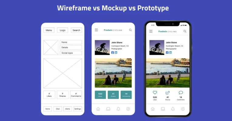
Wireframe = Structure (The Blueprint)
As established, a wireframe is the low-to-mid-fidelity blueprint. Its focus is purely on structure, layout, information architecture, and basic functionality. It’s typically static and grayscale, using placeholders for content and visuals. Its primary purpose is planning and structural communication.
Wireframes answer the question: “What goes where?” They are quick and cheap to create and iterate on, ideal for exploring layouts and flows early in the process before investing in detailed visual design. Feedback is sought on structure and usability.
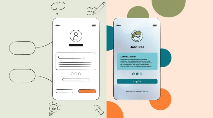
Mockup = Visuals (The Static Look)
A mockup is a mid-to-high-fidelity static representation of the final visual design. It focuses on the look and feel, including color palettes, typography, imagery, icons, and branding elements. It shows how the product will actually look.
Mockups answer the question: “What will it look like?” They are not interactive but provide a realistic preview of the final product’s aesthetics. They are used to get feedback on the visual design choices before development begins. Creating mockups requires more time and visual design skill.
Prototype = Interaction (The Testable Model)
A prototype is a mid-to-high-fidelity simulation of the final product used to test interactions and user flows. It may look visually complete (like a mockup) but adds clickability and basic functionality, allowing users to navigate between screens and interact with elements.
Prototypes answer the question: “How will it work?” They are essential for usability testing, allowing designers to observe users interacting with the proposed design and identify usability problems before development. Prototypes can range from simple click-through models to highly sophisticated simulations.
Where Do Wireframes Fit in the Design Process?
Wireframing is a crucial step situated early in the typical UX design workflow or overall design process. It acts as a bridge, translating initial research, requirements, and structural planning (like sitemaps or user flows) into the first tangible screen designs.
It generally occurs after foundational research (understanding users and business goals) and information architecture planning (defining content structure and navigation). It happens before detailed visual design (mockups) and the creation of interactive prototypes. It sets the stage for these later phases.
Wireframes take the abstract concepts from research and IA and give them concrete form on the screen. They provide the necessary blueprint that informs UI designers creating the visual mockups and developers building the final product, ensuring everyone is working from the same structural plan.
Tools for Creating Wireframes (Quick Overview)
A wide variety of wireframe tools are available, catering to different needs, fidelities, and collaboration styles. The choice often depends on the project complexity, team preferences, and the desired level of detail for the wireframe. Tools fall into a few broad categories.
Simple, low-fidelity wireframes can be effectively created using basic tools like pen and paper or whiteboards. These are great for quick sketching and brainstorming. For digital wireframes, options range from graphic design software to specialized wireframing and prototyping applications.
Graphic design software like Adobe Illustrator or even presentation software can be adapted for wireframing, but they may lack specific features. Dedicated wireframing tools like Balsamiq, Figma, Sketch, Adobe XD, Axure RP, and many others offer pre-built UI elements, collaboration features, and sometimes prototyping capabilities, streamlining the process.
Tips for Creating Effective Wireframes (Best Practices)
Creating effective wireframes involves more than just drawing boxes. Following certain best practices ensures your wireframes are clear, useful communication tools that genuinely contribute to a better design outcome. These practices help maintain focus, facilitate collaboration, and maximize the value of the wireframing effort.
Adhering to these guidelines helps avoid common pitfalls, like adding too much detail too soon or creating wireframes that are difficult for others to understand. Effective wireframing is about clear communication and efficient structural planning above all else.
Start with Clear Goals & Know Your Audience
Before drawing anything, define the purpose of the wireframe. What specific problem are you trying to solve with this screen? What is the primary goal for the user on this page? Knowing the goals helps prioritize elements and structure the layout effectively.
Also, consider who will be viewing and providing feedback on the wireframe (developers, stakeholders, other designers). Tailor the level of detail and annotations accordingly. Clearly communicate the wireframe’s purpose and expected feedback to ensure productive discussions aligned with the goals.
Focus on User Flow and Information Hierarchy
Effective wireframes clearly illustrate the intended user flow. How will users arrive at this screen, and where will they likely go next? Ensure navigation elements are logical and paths to complete key tasks are intuitive and straightforward. Think sequence and interaction.
Establish a clear information hierarchy. Use size and placement to guide the user’s attention to the most critical elements first. Important calls-to-action or key information should be prominent. Less critical items should be placed accordingly. This visual priority is fundamental.
Keep it Simple (Resist Adding Detail Too Early)
The mantra for wireframing, especially early on, is simplicity. Focus resolutely on structure, layout, and core functionality. Resist the temptation to add colors, specific fonts, detailed icons, or actual images. These details distract from structural feedback and belong in the mockup phase.
Use basic shapes and standard placeholders. This intentional lack of polish keeps conversations focused on the underlying framework. It also makes iteration faster, as you aren’t investing time in visual details that might change based on structural feedback.
Use Annotations Generously
Wireframes are static visuals; they don’t inherently explain interactions or complex logic. Use annotations (notes) directly on the wireframe to clarify functionality, describe interactive states (e.g., hover effects, error messages), specify content requirements, or explain design rationale. Clear annotations prevent guesswork.
Good annotations answer potential questions before they are asked. For example, next to a form, an annotation might read: “Form submits data via API call X. Success message appears below button.” This level of detail aids developers and clarifies intent for everyone involved.
Collaborate, Get Feedback, and Iterate!
Wireframing should not be a solo activity. Share your wireframes early and often with team members and stakeholders. Gather feedback on the structure, flow, and clarity. Be open to constructive criticism – the goal is to improve the design collaboratively.
Based on feedback, iterate on your wireframes. Don’t be afraid to discard ideas that aren’t working or create alternative versions to explore different solutions. Wireframing’s low-fidelity nature makes iteration quick and easy. This iterative process leads to a much stronger final design foundation.
In conclusion, wireframes are far more than just simple sketches. They are indispensable tools in the UX/UI design process, serving as the structural blueprint for websites, applications, and other digital interfaces. They bridge the gap between initial ideas and final designs.
By focusing on structure, layout, functionality, and user flow while intentionally omitting visual details, wireframes facilitate clear communication, enable early feedback, save significant time and cost, and keep the entire project focused on user needs. Embracing wireframing is embracing efficient, user-centered design. They are the critical starting point for building successful digital products.