Every journey needs a map, and on the internet, that map for a website is its navigation menu. It’s one of the very first things you notice and use when you land on a new site. For anyone involved in creating or managing a website, understanding this fundamental element is absolutely essential. Let’s explore exactly what a navigation menu is and why it holds such significant importance.
What is navigation menu?
A website navigation menu is fundamentally a list of links, typically displayed prominently, that serves as a roadmap guiding visitors through the content and pages of a website. Its core purpose is to provide users with a clear and structured way to discover and access the information they are looking for on the site.
Think of it as the primary interface element facilitating user interaction and exploration. It’s a key part of the user interface (UI), specifically designed to help users move from their entry point to other relevant sections or pages, making the website usable and intuitive to navigate.
You can relate a website navigation menu to a table of contents in a book or the directory signs you find in a large building or shopping mall. Just as those tools help you locate specific chapters or destinations, the navigation menu helps visitors pinpoint specific web pages or categories of content efficiently and quickly.
It’s far more than just a simple list; it’s a carefully considered piece of a website’s overall information architecture. Effective navigation design requires thought about the site’s structure and the user’s likely goals, ensuring the menu logically represents the hierarchy and relationships between different pieces of content.

Why is Website Navigation Important?
The importance of website navigation cannot be overstated, impacting both the people visiting your site and how search engines understand it. It is absolutely crucial for creating a positive user experience (UX) and ensuring your website is accessible and functional for everyone who lands on it, regardless of their technical skill level (as noted in HV1).
First and foremost, navigation is vital for usability. If visitors cannot easily find the information they seek, they will likely become frustrated. A clear, intuitive menu reduces the cognitive load on the user – they don’t have to guess or search aimlessly, which makes the site feel easy and pleasant to use.
This ease of use directly contributes to a better user experience. When visitors can effortlessly browse through your site, finding relevant pages and accomplishing their goals (like making a purchase, reading an article, or finding contact information), they are more likely to have a positive impression and stay on your site longer.
Poor navigation, conversely, leads to high bounce rates. A bounce happens when someone visits a page and leaves without interacting further. If your navigation is confusing or hidden, users can’t find the next step they intended to take, causing them to leave, signaling to search engines that the page didn’t meet their needs.
Effective navigation also helps guide the user journey. As a website owner or designer, you often have specific paths you want users to take, perhaps leading them towards a conversion goal. A well-designed navigation menu can subtly or overtly guide visitors down these desired paths by highlighting key sections or calls to action.
For business owners, this means better engagement and potentially higher conversion rates. When visitors can smoothly navigate from a landing page to a product page, then to a checkout or contact form, it removes friction from the funnel, increasing the likelihood of achieving business objectives.
From an accessibility standpoint, clear navigation is paramount. Users with disabilities, particularly those using screen readers or navigating with keyboards, rely heavily on well-structured, logically ordered, and semantically correct navigation elements to understand and operate a website. Neglecting this excludes a significant portion of potential visitors.
Moreover, navigation plays a critical role in establishing topical authority (a concept important to VT1’s SEO expertise). By linking related pages together within a clear menu structure, you signal to both users and search engines the breadth and depth of your coverage on specific topics. This structured internal linking supports the idea that your site is a comprehensive resource.
Ultimately, the importance of navigation boils down to effectiveness. A website exists to serve a purpose – whether it’s to inform, sell, entertain, or connect. Clear navigation ensures that purpose can be fulfilled by enabling visitors to access the content and functionalities that meet their needs, turning casual visitors into engaged users or customers.
How Does a Website Navigation Menu Work?
At its core, a website navigation menu functions through hyperlinks, commonly just called links. Each item displayed in the menu is a clickable element that, when activated by a user, instructs the web browser to load a different web page or a specific section within the current page. This is the fundamental mechanism driving movement across the internet.
Technically, these links are created using the HTML <a> tag (short for ‘anchor’). The <a> tag contains the text or image that the user sees and interacts with, along with an href attribute. The href attribute holds the Uniform Resource Locator (URL) of the destination page or resource.
When a user clicks on the navigation menu item, the browser reads the URL specified in the href attribute. It then sends a request to the web server where the website files are hosted, asking for the page located at that specific URL. The server processes the request and sends the requested page data back to the user’s browser.
The browser then interprets the HTML, CSS, and JavaScript code for the new page and renders it for the user to see. This entire process happens very quickly, ideally within a few seconds, creating the seamless experience of moving from one page to another when you click on a navigation link.
Essentially, the navigation menu acts as the user’s control panel for traversing the site. By presenting a curated list of key destinations (pages) on the website, it eliminates the need for users to manually type URLs (which would be highly impractical) or rely solely on internal text links buried within content.
The way the menu items are organized also conveys information architecture. A hierarchical structure, common in dropdown menus, shows parent-child relationships between pages (e.g., “Products” > “Electronics” > “Laptops”). This structure isn’t just for show; it’s part of how the menu communicates the site’s organization to the user.
Furthermore, modern navigation often uses client-side scripting languages like JavaScript to add interactive elements, such as smooth scrolling to page sections or complex mega-menus that appear on hover. While the underlying principle of clicking a link to request a resource remains, JavaScript enhances the presentation and interaction model.
Understanding this basic mechanism—that a navigation menu is a visual representation of underlying links that connect pages—is key to appreciating its function. It’s the bridge between the user’s intent to find information and the website’s structure holding that information, making content discoverable and accessible.
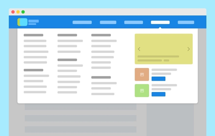
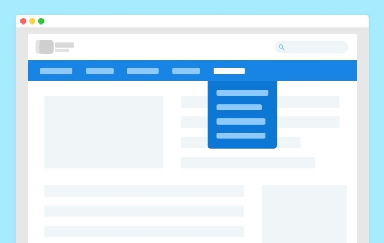
Common Locations and Types of Navigation Menus
Navigation menus are incredibly versatile and can appear in numerous places and take many forms, depending on the website’s design, content volume, and target audience (aligning with HV1 considerations). The chosen location and type significantly influence user interaction and the overall look and feel of the site.
The most common location is undoubtedly the Header Navigation, usually running horizontally across the very top of the web page, often within or just below the site’s logo. This is prime visual real estate, used for the most important, high-level pages that users will want to access from anywhere on the site, such as “Home,” “About Us,” “Services,” “Products,” and “Contact.”
Another popular location is the Sidebar Navigation, positioned vertically down the left or right side of the main content area. This is frequently used on blogs (for categories or archives), documentation websites, or web applications where there’s a large number of navigation items or deeper levels of hierarchy to display constantly alongside content.
For sites with extensive content or many main categories, Dropdown Menus are a common solution. These are primary menu items (often in the header) that reveal a secondary list of links (a “dropdown”) when a user hovers over or clicks on the main item. Examples include product categories on e-commerce sites or lists of services offered by a business. While they save space, they must be implemented carefully to ensure accessibility and usability, especially on touch devices.
The Hamburger Menu has become ubiquitous, particularly in responsive web design for mobile views. It’s represented by an icon of three horizontal lines (resembling a hamburger) that, when clicked, expands to reveal the navigation links, typically as a vertical list overlaying or pushing the main content. This design is crucial for saving space on small screens but requires the user to take an extra step to access the navigation, which is a key usability consideration.
Footer Navigation is found at the bottom of almost every website. While not usually containing the primary links, it’s essential for accessibility and providing links to important secondary pages like “Privacy Policy,” “Terms of Service,” “FAQs,” “Careers,” or additional contact information. It serves as a useful place for users who have scrolled through all the content but haven’t found what they needed or are looking for administrative links.
Breadcrumb Navigation is another type, though different in function. It’s a trail, often near the top of the page, showing the user’s current location within the website’s hierarchy (e.g., Home > Blog > Category > Article Title). Breadcrumbs are not used for initial navigation but help users understand context and easily move back up to parent categories. They are particularly useful on large sites with deep structures, like e-commerce or documentation sites.
Other less common or more specialized types include off-canvas menus (similar to hamburger but slide in), mega menus (large dropdown panels with multiple columns of links), and context-specific navigation that appears only on certain page types. The choice depends heavily on the website’s content volume, complexity, and the expected user behavior, aligning with the strategic thinking of VT1.
Navigation Menus and Search Engine Optimization (SEO)
As a critical element of website structure and user experience, navigation menus hold significant weight in Search Engine Optimization (SEO). How you structure and present your navigation directly impacts how search engines like Google crawl, understand, and index your website, ultimately affecting your visibility in search results.
Search engine bots, such as Googlebot, navigate the web by following links. Your navigation menu is one of the primary sources of internal links on your site. Crawlers read the menu’s code to discover new pages and re-crawl existing ones, which is fundamental to getting your content indexed and updated in Google’s search index.
A well-organized navigation menu provides search engines with clear signals about the structure and hierarchy of your website (TK1 semantic: site architecture, relationships). The links in your menu help Google understand which pages you consider most important and how different sections of your site relate to each other.
This internal linking structure also helps distribute “link equity” or “authority” throughout your site. When important pages are linked from the navigation, they receive more internal links, signaling their significance and potentially helping them rank higher for relevant queries (TK1 LSI: pages, links, hierarchy).
Furthermore, clear navigation improves crawl efficiency. If your site’s structure is easily navigable through the menu, crawlers can quickly find all your important content without getting lost or stuck. This is especially important for large websites with many pages. Inefficient navigation can waste crawl budget, causing some pages to be crawled less frequently or not at all.
Including relevant keywords in your navigation labels (without keyword stuffing) can also provide contextual clues to search engines about the content of the linked pages. For example, a menu item labeled “Web Design Services” is clear for users and tells search engines exactly what to expect on that page.
Poor or inaccessible navigation, such as menus built entirely with complex JavaScript that crawlers cannot easily parse or navigation hidden behind elements that prevent linking, can hinder search engine access and understanding. This directly impacts your site’s indexability and ability to rank.
In essence, optimizing your navigation for SEO means making it clear, crawlable, and structured logically. It’s about ensuring that the map you provide for users is also a clear set of instructions for search engines on how to discover and value your content. This strategic alignment benefits both user experience and search performance, a core tenet of VT1’s approach.
Key Qualities of Good Website Navigation
Creating effective website navigation involves more than just adding a list of links. Good navigation possesses several key qualities that contribute significantly to usability, user experience, and ultimately, the success of the website for both its visitors and its owners. Adhering to these principles is essential for providing a high-quality, helpful experience (aligning with HV1 and Google’s helpful content guidance).
- Clarity and Simplicity: This is perhaps the most important quality. Navigation labels should be intuitive and immediately understandable to the target audience (HV1). Avoid jargon, ambiguous terms, or overly clever wording. The menu should be concise, presenting the most important options without overwhelming the user with too many choices at once. Think direct, plain language (HV1 communication style).
- Consistency: A good navigation menu appears in the same location and has a consistent look and behavior across every page of the website (with few exceptions, like dedicated landing pages). This consistency builds familiarity and confidence, allowing users to navigate effortlessly without having to re-learn the menu on each new page they visit.
- Responsiveness: In today’s mobile-first world (VT1 knowledge, TK1 attribute), responsive navigation is non-negotiable. The menu must adapt seamlessly to different screen sizes, from large desktop monitors to tablets and smartphones. This often involves transforming the layout, such as switching from a horizontal desktop menu to a hamburger menu on mobile, ensuring usability regardless of device.
- Accessibility: Good navigation is accessible to everyone, including users with disabilities. This means ensuring the menu can be navigated using a keyboard (not just a mouse), that link text is descriptive and meaningful when read out by screen readers, and that there is sufficient color contrast for users with visual impairments. Using semantic HTML tags like
<nav>properly is crucial here, as it signals to assistive technologies that this block of links is the primary navigation. - Logical Structure and Order: The links within the navigation should be organized logically, reflecting the website’s information architecture. Important pages should be easily discoverable, often placed at the beginning of the menu (especially in left-to-right languages). Grouping related pages under clear categories (as in dropdowns) helps users understand the relationships between different content areas (TK1 relationships, TK1 semantic: information architecture).
- Discoverability: The navigation menu must be easy to find on the page. Common locations (top header, sidebar) contribute to this. The visual design should make it stand out slightly from the surrounding content without being overly distracting. Users shouldn’t have to hunt for the menu.
- Feedback: Good navigation often provides visual feedback to the user. For example, highlighting the current page in the navigation menu helps users orient themselves and understand where they are within the site structure. Hover effects or subtle animations can also indicate that an element is interactive.
By focusing on these qualities—Clarity, Consistency, Responsiveness, Accessibility, Logical Structure, Discoverability, and Feedback—you create navigation that effectively serves its purpose, enhances the user experience, and builds a strong foundation for both user engagement and search engine visibility. These principles are universally applicable and form the bedrock of effective web design for any type of website.
Conclusion
To sum it up, a website navigation menu is a fundamental and indispensable element of web design. It is essentially a structured list of links that serves as the user’s primary tool for moving through a website, discovering content, and understanding the site’s overall structure.
More than just a functional component, effective navigation is crucial for delivering a positive user experience, making a website easy to use, and enabling visitors to quickly find the information or complete the tasks they intended to. It acts as the bridge between the user and the site’s content.
Furthermore, navigation plays a vital role in SEO, helping search engines efficiently crawl, understand, and index the website’s pages, which directly impacts visibility in search results. A well-organized menu benefits both the human user and the search engine bot, creating a win-win situation for site owners.
Understanding what a navigation menu is, how it works, the different forms it can take, and the key qualities that make it effective is foundational knowledge for anyone involved in the web. By prioritizing clear, intuitive, responsive, and accessible navigation, you build a stronger, more user-friendly, and more search engine-friendly website.
Effective website navigation helps users find information easily, yet the speed at which pages load after they click a navigation link profoundly impacts their overall experience. To ensure your website delivers consistently fast and stable performance, essential for providing seamless user journeys across your content, having a reliable hosting foundation is key. A service like Vietnam VPS provides this crucial backbone, enabling the high speed and stability necessary for visitors navigating your site effectively with powerful new generation hardware.